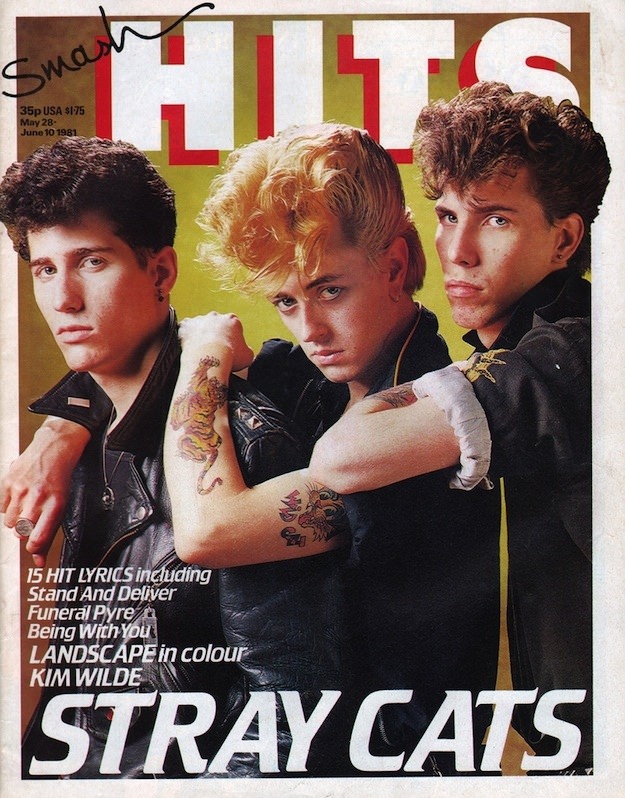
Bold block lettering shouting “HITS” across the top and the handwritten “Smash” signature in the corner set the tone for a classic 1980s pop magazine moment. Center stage, the cover locks you into the intense, styled stare of the featured band, framed by high-volume hair, leather, and that unmistakable studio-lit polish that defined the era’s teen music press. Even the small-print cover details—issue pricing and a date range—add to the time-capsule feel that collectors and nostalgia hunters love.
Three musicians pose shoulder-to-shoulder in a tight, confrontational lineup, their arms crossed and angled to show off tattoos and attitude. The background stays clean and bright, letting the faces, textures, and fashion do the talking while the oversized “STRAY CATS” headline anchors the composition in pure newsstand impact. It’s cover art built for instant recognition: sharp, minimal, and louder than the music posters on the bedroom wall.
Beyond the star power, what makes Smash Hits covers iconic is the way they package a whole music world into a single frame—song lyrics teased on the left, other acts name-checked, and design choices that balance accessibility with edge. For anyone exploring 1980s magazine cover design, pop culture history, or the visual language of UK music journalism, this image offers a vivid snapshot of how style and sound were sold together. Fans of retro print, new wave aesthetics, and classic band photography will find plenty to zoom in on, from typography to wardrobe to the carefully staged swagger.