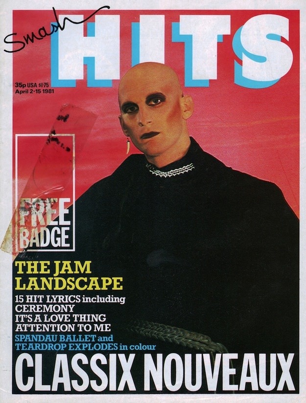
Bold blocks of colour and oversized lettering announce the unmistakable look of Smash Hits, a pop magazine that turned the newsstand into a stage. Against a hot pink backdrop, the masthead looms in chunky type while a starkly styled portrait dominates the frame, topped off with inky makeup and a cool, confrontational gaze. Even before you read a word, the cover design communicates attitude—graphic, loud, and perfectly tuned to the era’s love of visual punch.
On the left, the classic cover-line clutter does what Smash Hits always did so well: promise a whole world of music inside. A “Free Badge” callout sits beside tightly packed features, lyric teases, and band mentions, mixing fandom and consumer fun in the same breath. At the bottom, “CLASSIX NOUVEAUX” is splashed in huge type, anchoring the layout and pulling the eye downward like a headline at a gig poster.
Collectors and 1980s pop culture fans will recognize how these magazine covers functioned as mini time capsules—part journalism, part design experiment, part teen bedroom décor. This post dives into the iconic Smash Hits cover art language: high-contrast photography, playful typography, and the irresistible promise of exclusives, lyrics, and badges. If you’re searching for Smash Hits magazine covers, 1980s cover design inspiration, or a vivid slice of UK pop print history, this issue’s front page is a perfect doorway in.