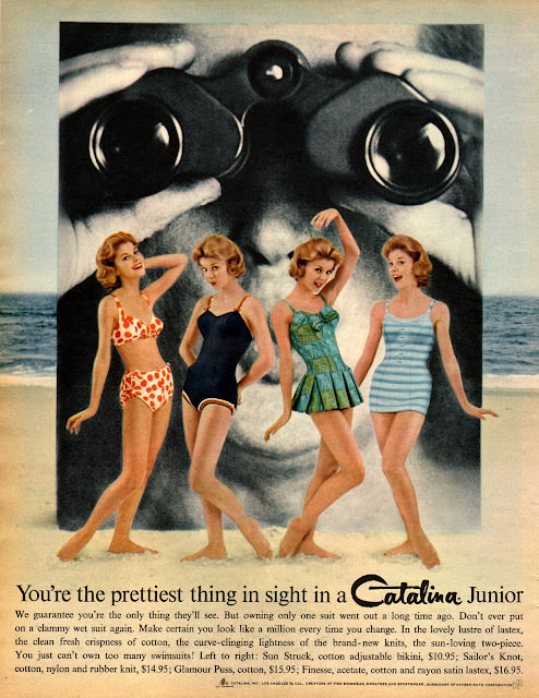
A playful collision of glamour and marketing fills this Seventeen magazine–style cover art, where four swimsuit-clad models strike breezy, mid-century poses against a seaside backdrop. Looming behind them, an oversized face with binoculars turns the scene into a cheeky visual punchline, a reminder that 1960s fashion illustration often leaned on bold, attention-grabbing concepts as much as it did on hemlines and silhouettes. The mix of pin-up polish and teen-mag buoyancy makes the era’s optimism feel immediate.
Swimwear takes center stage: a patterned two-piece, sleek one-piece suits, and a structured, skirted design that hints at the period’s fascination with playful shapes and “new” figure-flattering cuts. The styling is unmistakably of its time—carefully coiffed hair, confident smiles, and poses that read like choreography for a window display. Even without a specific date or issue spelled out here, the composition speaks clearly to 1960s fashion trends aimed at young readers discovering identity through clothes.
At the bottom, the advertisement copy and prominent “Catalina Junior” branding do more than sell a suit—they sell a mood of summer freedom, youthful confidence, and consumer promise. The language about fit, fabrics, and “prettiest thing in sight” reflects how teen magazines blended editorial fantasy with direct-to-reader salesmanship, shaping aspirations one page at a time. For anyone exploring vintage Seventeen magazine cover art, retro swimsuit advertising, or 1960s youth culture, this piece is a compact lesson in how groovy threads and bold ads worked together to define a decade.