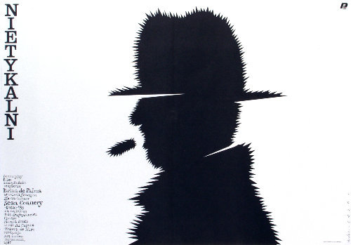
A stark silhouette dominates Mieczyslaw Wasilewski’s 1987 cover art for “The Untouchables,” pared down to a single figure whose profile is instantly legible and yet intentionally withheld. The head and shoulders are rendered as a dense black mass, but the outline bristles with sharp, irregular spikes that make the body feel charged, dangerous, and untouchable in the most literal sense. Against the clean white field, the contrast reads like a visual siren—minimal elements, maximum tension.
Two horizontal slashes cut through the face and torso, like bands of light or deliberate censorship, interrupting any comfortable attempt to “read” the character. That graphic interruption suggests secrecy, surveillance, and the way legends are constructed: not from full access, but from fragments and omissions. The rough, vibrating edge of the silhouette also pushes the piece toward psychological territory, turning a simple profile into a portrait of menace, myth, and guarded identity.
Typography anchors the composition with a vertical title at the left—“NIETYKALNI,” the Polish for “The Untouchables”—and compact credits that reinforce its origin as poster or cover design rather than straightforward illustration. Wasilewski’s approach is a concise lesson in late-20th-century graphic design: reduction, symbolism, and a punchy visual hook that works at a glance. For collectors of Polish poster art, film cover art, and minimalist illustration, this image remains a striking example of how a single silhouette can carry an entire narrative.