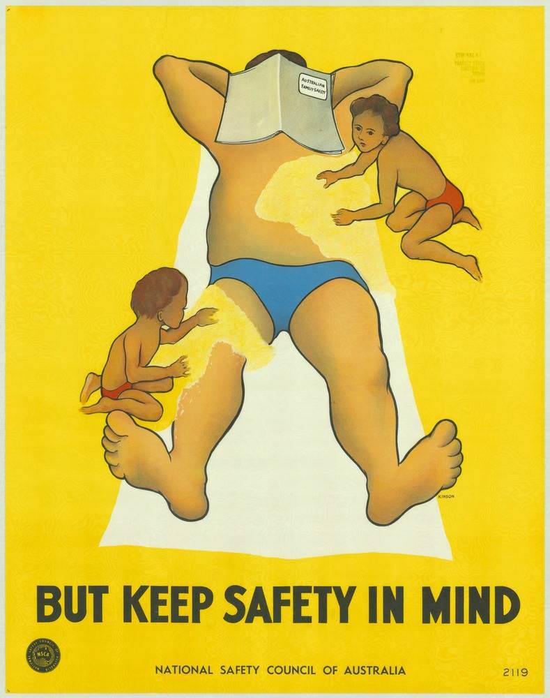
Sun-drenched yellows and bold, blocky lettering set the tone for this striking piece of 1970s Australian safety design, where a relaxed beach scene is turned into a cautionary lesson. A reclining adult figure lies on a towel with a book titled “Australian Sun Safety” covering the face, while two small children in swimsuits crawl nearby, framed in warm, simplified shapes. The poster’s punchline sits at the bottom in heavy type—“BUT KEEP SAFETY IN MIND”—making the message impossible to miss.
Rather than relying on shock, the artwork uses humour and everyday familiarity to talk about prevention, hinting at the risks that can accompany leisure and sunshine. The composition draws the eye from the children’s curious movement to the adult’s stillness, then down to the warning, creating a narrative about supervision, sun exposure, and the easy way vigilance can slip during a day outdoors. With minimal detail and strong colour contrast, it reflects the era’s preference for clear, instantly readable public health communication.
As cover art for a collection of National Safety Council of Australia posters from the 1970s, this image highlights how visual messaging helped shape public attitudes toward keeping people safe and well. Designers and safety advocates leaned on memorable graphics, plain language, and domestic scenes to reach families beyond workplaces and roadways. For readers interested in Australian poster history, public safety campaigns, or retro graphic design, it’s a vivid reminder that the past spoke loudly about prevention—especially when it came dressed in summer colours.