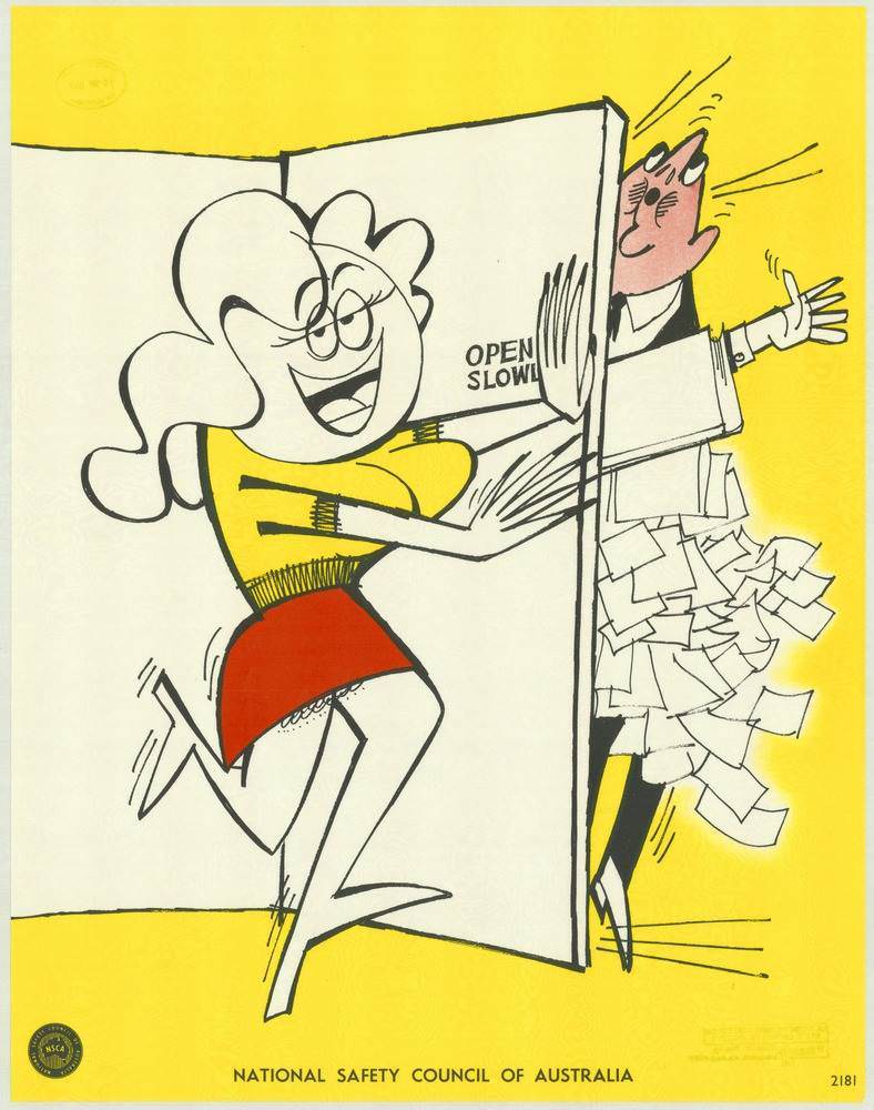
Bold blocks of yellow and a lively cartoon scene announce the National Safety Council of Australia’s unmistakable 1970s design language. A smiling woman swings a door inward while the words “OPEN SLOW!” sit near the hinge, and on the other side a startled office worker is caught in the impact, his papers bursting outward in a flurry. The simple lines, exaggerated expressions, and limited palette turn a split-second mishap into an instantly readable lesson.
Humour does the heavy lifting here, making workplace safety feel memorable rather than scolding. The poster’s message is aimed at everyday office routines—doorways, corridors, distracted movement—where small careless moments can cause real injuries. By dramatizing the collision and the chaos of flying documents, the artwork turns a mundane action into a cautionary reminder to pause, look, and open doors carefully.
As cover art for a set of National Safety Council of Australia posters from the 1970s, this piece showcases how visual messages were crafted to keep people safe and well. Its clear typography, punchy composition, and friendly cartooning reflect an era when public safety campaigns leaned on bold graphic communication to reach busy workers fast. For readers interested in Australian safety history, vintage posters, or retro graphic design, it’s a vivid example of how prevention was promoted with wit and clarity.