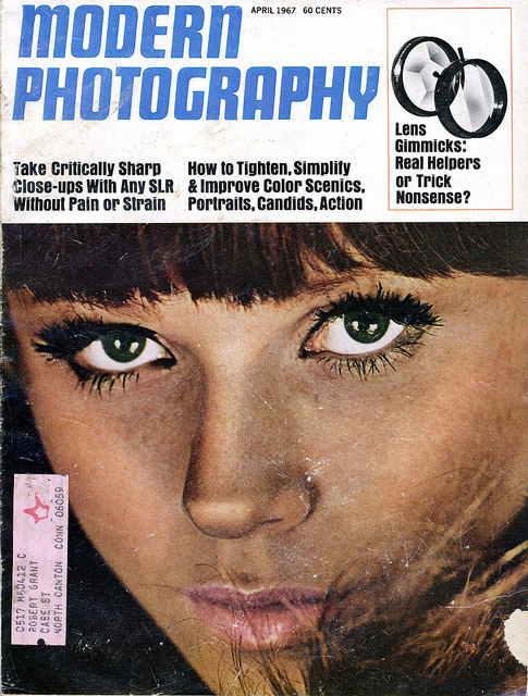
Bold typography and a tightly cropped portrait announce the era of *Modern Photography* with the immediacy only mid-century magazine design could manage. The April 1967 cover, priced at 60 cents, pairs a wide, blue masthead with a face-filling close-up—heavy lashes, sharp eyeliner, and a direct gaze—turning photographic technique into pop-culture allure. Even the worn edges and creases tell their own story, hinting at a well-handled issue that once moved between camera bags, coffee tables, and darkroom discussions.
Across the top, the cover lines read like a snapshot of what photographers were chasing in the late 1960s: critically sharp close-ups with an SLR, simplified composition, and better color in “scenics, portraits, candids, action.” A small graphic of lens accessories teases “Lens Gimmicks,” capturing that familiar tension between practical craft and the constant market of add-ons promising better pictures. It’s a compact lesson in how photography magazines marketed expertise—part classroom, part catalog, part cultural mirror.
Collectors and design lovers will appreciate how this vintage cover art bridges editorial history and visual trends, from the punchy, modernist layout to the glamour-forward portrait styling. For anyone researching 1950s and 1960s photography magazines, the issue stands as a vivid example of how publication covers sold not just articles, but a whole identity of the “modern” photographer. Browse, compare, and let the graphic choices—type, color blocks, and cropping—reveal what the camera world valued, debated, and aspired to in print.