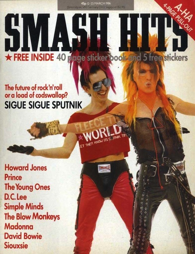
Smash Hits explodes across the page in heavyweight block lettering, immediately announcing the loud, playful confidence that defined so much 1980s pop culture. The cover leans into spectacle: bold red callouts, a promise of “FREE INSIDE” extras, and a neatly stacked list of must-read names that turns the magazine into a snapshot of what was buzzing in music at the time. Even the price line at the top and the punchy typography feel like period details worth lingering over, the sort that collectors and design fans love to zoom in on.
Front and center, the featured duo’s styling does most of the talking—sharp hair, dramatic makeup, and a mix of mesh, leather, straps, and attitude that reads like a manifesto for pop-meets-punk fashion. Their expressive poses and direct gaze sell the idea that music wasn’t just something you listened to; it was something you wore, argued about, and performed in everyday life. The overall effect is deliberately confrontational and funny at once, perfectly aligned with a magazine that thrived on cheeky headlines and bold visuals.
Inside Smash Hits: The Iconic Magazine Covers of the 1980s Cover Art uses this kind of cover to trace how magazines became tastemakers, translating sound into imagery that could stop you at the newsstand. Beyond the nostalgia, there’s real historical texture here—how bands were packaged, how trends were named, and how graphic design made pop feel immediate and personal. For anyone searching for 1980s magazine cover art, Smash Hits covers, or the visual history of British pop media, this image is a vivid reminder of when a single weekly could feel like the center of the music universe.