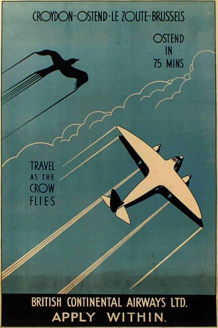
Modernist lettering stretches across a cool blue sky—“Croydon–Ostend–Le Zoute–Brussels”—while a sleek airliner banks beneath a single drawn cloud and the silhouette of a crow. The design is spare but confident, turning speed into a promise with “Ostend in 75 mins” and the memorable slogan “Travel as the crow flies.” With long, stylized motion lines trailing behind both bird and aircraft, the poster sells not just a ticket, but the new logic of straight-line travel.
Airline advertising in the 1920s and 1930s leaned heavily on bold graphics and simple comparisons that anyone could grasp, and this cover art is a textbook example. By pairing the plane with a familiar creature of the sky, it makes early air travel feel intuitive—natural even—while the clean geometry and limited palette project reliability and modernity. The emphasis on minutes, routes, and effortless ascent reflects an era when flying still carried novelty and prestige, and posters had to translate that excitement into trust.
At the bottom, “British Continental Airways Ltd.” anchors the romance of flight in practical commerce, capped with the brisk instruction: “Apply within.” For readers interested in Imperial Airways posters and the wider visual culture of interwar aviation, this piece highlights how airlines marketed progress through typography, streamlined forms, and the thrill of faster connections across the Channel. It’s a vivid reminder that the story of early air travel was told as much on walls and in stations as it was in the cockpit.