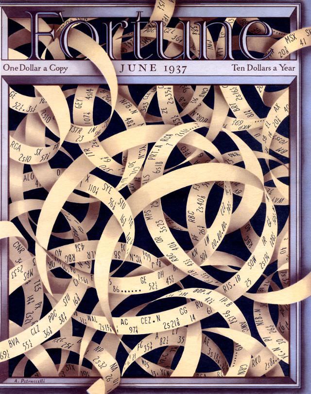
Fortune’s June 1937 cover greets the eye with a smart piece of graphic storytelling: a dense tangle of curling paper strips, each marked with terse letters and numbers, twisting across a dark field like ticker tape set loose. The magazine’s bold masthead hovers above the confusion, while the period pricing—“One Dollar a Copy” and “Ten Dollars a Year”—anchors the design in the consumer world of the 1930s.
The composition feels deliberately claustrophobic, as though the modern economy has become a knot of codes, transactions, and messages no single reader can fully unwind. Those looping ribbons suggest paperwork, telegraphy, or market quotations—tools meant to make commerce legible—now piled into an abstract maze that hints at speed, volume, and uncertainty.
For collectors of vintage magazine covers and students of American graphic design, this Fortune cover art stands as a striking emblem of interwar business culture. It captures the era’s confidence in information and systems even as it acknowledges their complexity, making it a memorable artifact for anyone exploring the visual history of finance, industry, and the printed press.