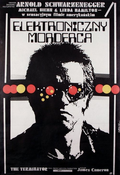
Bold Polish lettering—“ELEKTRONICZNY MORDERC A”—dominates Jakub Erol’s 1987 cover art for *The Terminator*, immediately reframing the film’s premise as something cold, mechanized, and inevitable. Above the title, the familiar cast names appear, anchoring the design in movie-poster tradition while the layout pushes toward graphic modernism rather than photographic realism. Even before you study the central portrait, the typography and stark contrast signal a high-stakes sci‑fi thriller built around technology and fear.
At the center sits a harsh, high-contrast face, rendered in deep blacks and pale whites, with a single red circular “eye” burning through the composition. A row of colored dots—reds, yellows, and muted tones—runs horizontally like instrument lights on a control panel, suggesting circuitry, targeting systems, and the logic of a machine at work. The overall effect is both human and inhuman: a recognizable silhouette turned into an icon, where one bright detail becomes the entire story of the cyborg presence.
Lower text grounds the piece in its cinematic identity, with *The Terminator* title and a credit line for director James Cameron appearing near the bottom edge, reminding viewers that this is promotional art as much as it is pop-graphic statement. For collectors of film poster design, Polish movie posters, and 1980s sci‑fi memorabilia, Erol’s interpretation stands out for how efficiently it translates the movie’s menace into symbols—type, color accents, and a single mechanical gaze. Posted today, it reads like a snapshot of how international poster art could reinterpret Hollywood spectacle into something sharper, stranger, and unforgettable.