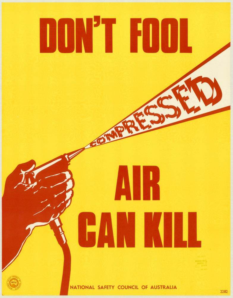
Bold yellow and red graphics deliver a blunt warning: “DON’T FOOL … AIR CAN KILL.” A clenched hand grips an air hose, and the word “COMPRESSED” is blasted forward like a dangerous jet, turning typography into a visual metaphor for force. Along the bottom edge, the credit line for the National Safety Council of Australia anchors the design as an official public safety message rather than mere decoration.
Posters like this, produced in the 1970s, show how workplace safety communication leaned on high-contrast color, minimal text, and instantly readable symbols to cut through noise on factory floors and in workshops. The threat isn’t abstract; the composition makes compressed air feel immediate, fast, and potentially lethal, reinforcing that everyday tools can become hazards when treated casually. Its spare layout and commanding lettering reflect an era when industrial health and safety campaigns increasingly pushed for practical awareness in routine tasks.
As cover art for this collection, the image sets the tone for a broader look at National Safety Council of Australia posters and their visual messages for keeping people safe and well. For historians, designers, and anyone interested in occupational health and safety, it’s a vivid example of Australian safety poster design—part instruction, part alarm bell, and entirely focused on prevention. Even decades later, the poster’s directness remains a reminder that clear communication can save lives.