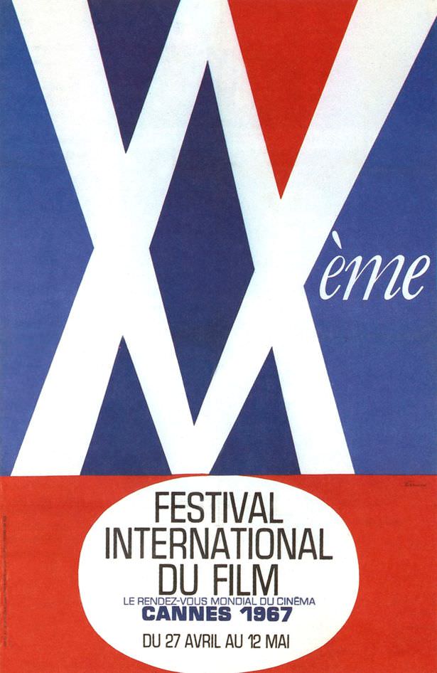
Bold geometry dominates the frame: oversized white X shapes slice across deep blue, while a sharp red wedge pushes in from above like a beam of light. The playful “Xème” script hints at an anniversary edition, and the whole composition reads like spotlights crisscrossing a night sky—clean, modern, and a little cheeky in the way only 1960s design seems to manage.
Down in the oval cartouche, the purpose becomes clear with crisp French typography: “Festival International du Film,” “Cannes 1967,” and the dates “Du 27 Avril au 12 Mai.” It’s cover art that doubles as a poster, built to be legible at a glance yet memorable in silhouette, capturing that era’s confidence in big type, limited colors, and high-contrast graphic punch.
Designers of the period often borrowed from stage lighting, cinema marquees, and op-art rhythms, and this Cannes Film Festival graphic fits right into that visual conversation. For anyone searching for Cannes 1967 poster art, vintage film festival ephemera, or mid-century modern graphic design, the piece offers a compact lesson in how international cinema sold itself: not with a star’s face, but with a striking symbol and a promise of spectacle.