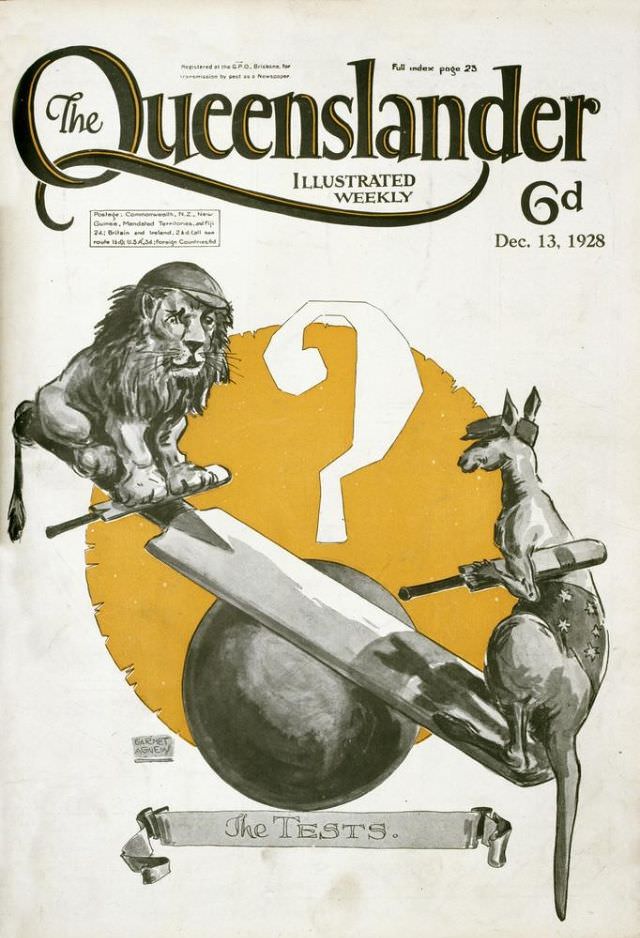
Bold typography announces *The Queenslander* as an “Illustrated Weekly,” priced at 6d, with the issue dated Dec. 13, 1928, and the cover wastes no time in leaning into spectacle. A large question mark hangs over a warm, golden backdrop, setting up a visual riddle that would have caught the eye on a newsstand. Even the small note about a “Full index page 23” hints at a substantial, varied magazine inside.
At the center, a lion and a kangaroo face off in a tense balancing act, perched on a plank that rides atop a heavy spherical weight, as if the whole scene could tip at any moment. Both animals hold batons, turning the composition into a metaphorical contest rather than a natural encounter, while the question mark suggests uncertainty, prediction, or a challenge awaiting an answer. The caption at the bottom—“The TESTS.”—frames the illustration as a commentary on trials, standards, or proving grounds, making the symbolism feel deliberate and pointed.
As cover art from late-1920s Australia, this piece reflects how magazines used allegory and strong graphic design to sell weekly news, sport, and public debate in a single glance. The limited palette—dominated by greys, black linework, and the standout gold—keeps the focus on the narrative tension between the two emblems. For collectors and researchers of Australian print culture, this *Queenslander* front cover is a striking example of period illustration, editorial teasing, and the visual language of interwar publishing.