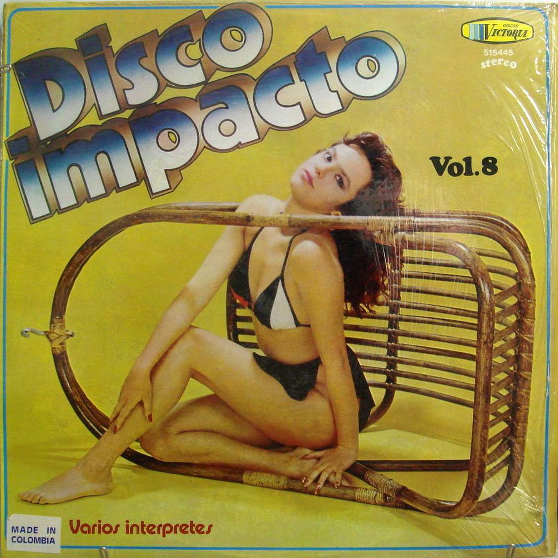
Bold lettering reading “Disco Impacto” leans across a mustard-yellow field, setting a loud, playful tone before your eye even reaches the model posed inside a toppled wicker chair. The composition turns everyday furniture into a graphic frame, with the figure’s relaxed gaze and angular pose doing as much design work as the typography. It’s the kind of cover art that sells attitude first, promising dance-floor energy through color, scale, and suggestion rather than narrative detail.
Small bits of printed information hint at the record’s commercial life: “Vol. 8,” a “stereo” tag, and a corner stamp noting “Made in Colombia,” along with “Varios interpretes.” Those elements, tucked beside the logo and catalog numbers, are part of the era’s visual language—half advertisement, half design signature—when album sleeves competed for attention in shop bins and on living-room stacks. Even without naming artists, the packaging speaks clearly about a market hungry for compilation hits and the glamour associated with disco culture.
Within the wider story of unusual and unconventional album cover designs from the 1960s and 1970s, this sleeve stands out for its cheeky minimalism: a single prop, a single backdrop, and a concept that’s instantly legible at a glance. The warm palette, oversized title treatment, and staged studio look combine into a memorable piece of vintage record cover design that collectors love to debate and rediscover. For anyone researching retro graphic design, disco aesthetics, or international LP cover art, it’s a vivid reminder that the sleeve was often the first beat you heard.