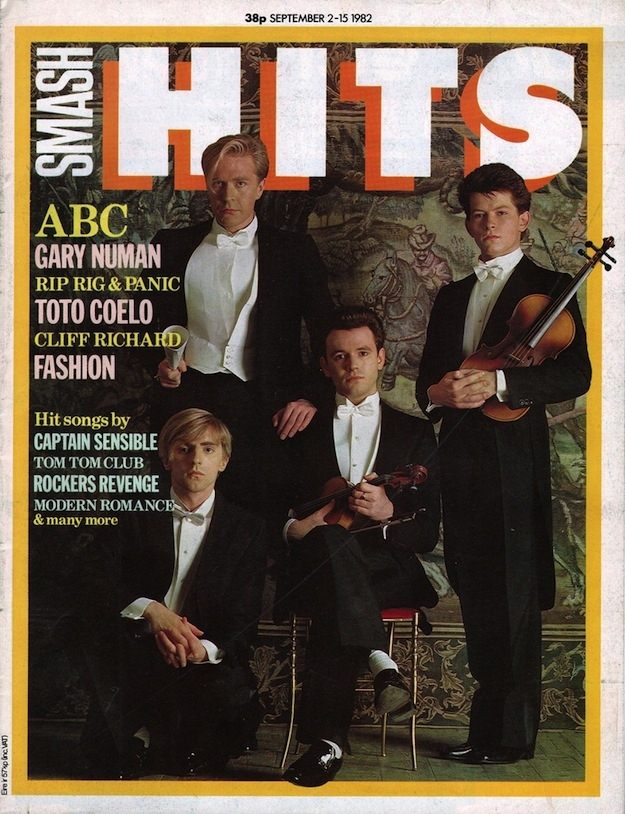
Bold block lettering shouts “SMASH HITS” across the top, anchoring a cover that feels instantly 1980s in its confidence and color. Beneath the masthead, three sharply dressed young men pose in formal eveningwear against a richly patterned backdrop, one holding a violin to heighten the theatrical, high-culture twist. The price and issue line at the top and the crowded teaser text along the side complete that classic magazine-cover rhythm: part poster, part shop-front, built to stop you mid-aisle.
From a design-history angle, the appeal lies in the mix of polish and pop urgency. The palette leans into strong contrast—white typography, dark suits, and a warm border—while the cover lines rattle off a roll call of artists and features that defined the era’s music press, from chart chatter to “Fashion” as a selling point. It’s a reminder that Smash Hits didn’t just report on pop; it packaged a whole lifestyle, turning new singles and new looks into collectible cover art.
Inside Smash Hits: The Iconic Magazine Covers of the 1980s Cover Art looks back at how these pages were composed to travel far beyond their publication week. Covers like this one functioned as miniature time capsules, capturing the period’s taste for stylized portraits, big type, and rapid-fire promises of what you’d find inside. For collectors, designers, and anyone tracing the visual language of 1980s pop culture, this cover offers a vivid slice of the magazine’s unmistakable identity.