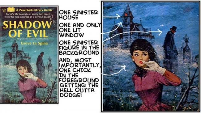
Gothic romance cover art thrives on a single, instantly readable scenario: a woman in the foreground, caught mid-flight, glancing back toward a looming house with just one glowing window. In the composition shown here, the mansion-like silhouette rises out of mist and cold color, while a dark, distant figure stands as a vague threat rather than a fully defined character. That imbalance—sharp emotion up close, uncertainty in the background—is exactly what makes these paperback covers so hard to ignore on a shelf or in a thumbnail.
What lingers is the psychological tug-of-war built into the pose: she is running, yet her attention is still anchored to what she’s leaving behind. The arched brows, parted lips, and raised hand suggest both alarm and deliberation, as if she’s weighing whether danger is real or imagined. Gothic romance cover illustration often borrows the visual language of suspense—fog, night skies, silhouetted architecture—to externalize anxiety, turning the house into a stand-in for secrets, taboo desire, or a past that refuses to stay buried.
Seen through the lens of publishing history, these melodramatic choices function like a promise to the reader: heightened emotion, peril, and a love story braided with dread. The “woman running from the house” trope endures because it compresses an entire narrative into one moment—escape, pursuit, and unresolved attraction—without needing plot spoilers. For anyone interested in the psychology of gothic romance covers, this artwork is a clean example of how color, distance, and gaze direction can turn a simple scene into an irresistible invitation to read.