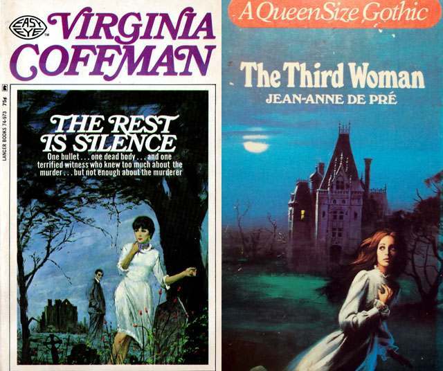
Gothic romance cover art thrives on a single, breathless moment: a woman in motion, caught between the safety of the lit interior and the threat implied by the night outside. In the examples shown here, fear is staged as elegance—wind-tossed hair, a pale dress, and a turned shoulder that invites the reader to look back with her. That pose does more than decorate; it signals urgency, vulnerability, and the promise that something unseen has just crossed the threshold.
On the left, the composition leans into isolation, with a stark landscape and a distant figure that complicates the heroine’s flight, suggesting pursuit, suspicion, or the unreliable comfort of company. On the right, a looming mansion rises behind the runner like a character in its own right, its dark windows and sharp roofline amplifying the sense of surveillance and enclosure. The typography, author names, and “Queen Size Gothic” branding anchor the image in mass-market publishing, where these repeated visual cues helped readers instantly find the mood they craved.
Psychologically, the “woman running from a house” motif works because it compresses a whole narrative into a readable silhouette: escape versus attachment, curiosity versus caution, romance shadowed by danger. The house becomes a symbol of secrets—inheritance, marriage, family history, or crime—while the open air offers freedom that may be as frightening as confinement. For anyone exploring vintage paperback illustration, gothic romance aesthetics, or the history of cover design, these covers show how suspense and desire were packaged into one unforgettable, searchable image.