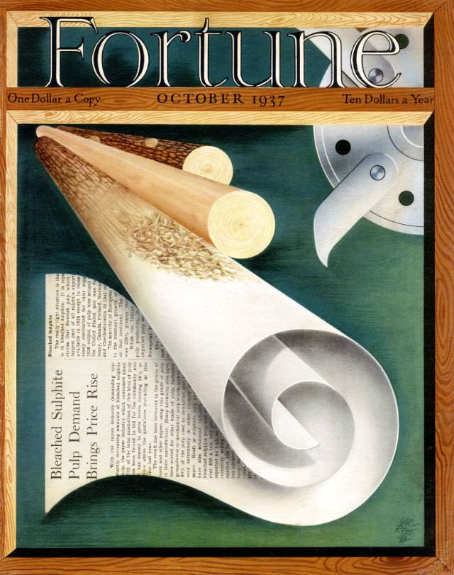
Fortune’s October 1937 cover turns the making of paper into modern spectacle, framing a curled sheet like a finished product fresh from the mill. A pair of timber logs and a sleek industrial cutting wheel hover above a printed column, linking forest resources, factory precision, and the words that ultimately reach the reader. Even the typography at the top—bold masthead, issue month, and price—signals a magazine confident in design as much as in business reporting.
At the center, the paper roll unfurls in a dramatic spiral, its bright whites and soft grays set against a deep green field that evokes both ink and machinery. The wood grain border and the warm tones of the logs contrast with the clean, engineered gleam of the blade, suggesting a world where natural materials are transformed by industrial processes. Visible text on the sheet hints at the era’s fascination with production and demand, turning a simple page into a story about scale, supply, and technology.
Collectors and history lovers often seek out Fortune magazine covers from the 1930s for their Art Deco–leaning polish and their celebration of American industry during a turbulent decade. This cover art works as a snapshot of how business media packaged big themes—forestry, pulp, manufacturing, and print culture—into a single, memorable illustration. For anyone researching vintage magazine design or the visual language of prewar commerce, October 1937 offers a striking, SEO-friendly example of Fortune’s iconic graphic identity.