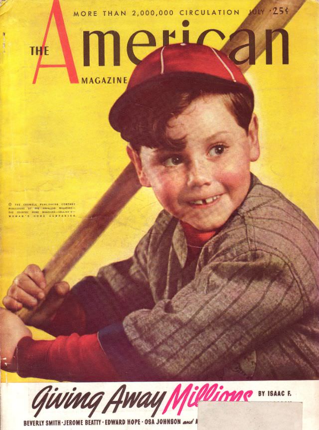
Bright, painterly color and an unmistakably bold masthead pull the eye straight to a young baseball player poised with bat in hand, glancing off to the side as if listening for the next pitch. The yellow background amplifies the warm reds of the cap and sleeves, while the pinstriped uniform nods to America’s enduring love affair with the ballpark. Across the top, the cover’s circulation boast and July issue line hint at a confident, mass-market magazine culture built on big audiences and bigger promises.
Baseball here reads less like a game than a symbol—youthful optimism, summer heat, and the everyday drama of trying to connect. The illustrator’s attention to rosy cheeks, a slightly mischievous smile, and the tension in the grip makes the moment feel lively and personal, even as it’s carefully staged for the newsstand. For readers browsing a WordPress archive of vintage magazine covers, this artwork offers a vivid snapshot of how American popular media used sports imagery to sell a feeling of national togetherness.
Along the bottom, the prominent teaser “Giving Away Millions” sits beside smaller author and contributor lines, a reminder that cover art worked hand-in-hand with attention-grabbing headlines. It’s a classic example of early 20th-century magazine design: strong typography, a single charismatic figure, and a story hook meant to turn a casual glance into a purchase. Whether you’re researching The American Magazine cover history or collecting retro illustration, this July cover remains a striking piece of period advertising and visual storytelling.