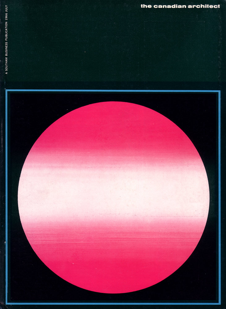
Bold modernism radiates from the July 1966 cover of *The Canadian Architect*, where a luminous pink-red circle floats against a deep, inky field. Subtle horizontal banding softens the geometric form, creating a sense of atmosphere—part sunrise, part lens flare, part carefully calibrated gradient. A thin blue border frames the composition with crisp precision, reinforcing the era’s fascination with clean lines and controlled color.
At the top right, the minimalist masthead “the canadian architect” sits quietly, letting the artwork do the talking while still anchoring the design as a professional journal cover. Along the left edge, small vertical text reads “a southam business publication,” a reminder of the magazine’s place within mid-century publishing and the broader networks that shaped architectural discourse. The overall layout feels intentional and restrained, a graphic statement that mirrors the confidence of 1960s design culture.
As cover art, this piece works like a visual thesis: architecture was not only about buildings, but also about systems, optics, and modern identity. The near-planetary circle invites readers to think big—about space-age optimism, new materials, and the sleek abstractions that dominated Canadian and international visual language in the 1960s. For collectors, designers, and historians, this July 1966 *Canadian Architect* cover is a striking example of vintage magazine design and the graphic sensibilities that helped define an era.