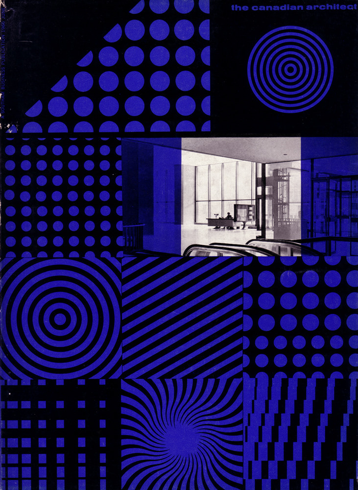
Bold optical patterns and a cool electric blue set the tone on the cover of *The Canadian Architect* for June 1966, instantly placing it in the graphic confidence of the mid-century modern era. Circles, grids, stripes, and spirals are arranged like a designer’s sampler, echoing the period’s fascination with geometry, repetition, and visual rhythm. Even with its minimal palette, the layout feels lively and technical at once—an aesthetic bridge between pop-forward print design and the discipline of architectural drafting.
At the center, a monochrome architectural interior anchors the abstraction with a glimpse of real space: clean lines, broad glazing, and sleek surfaces that suggest a modern building designed for light and openness. The contrast between the crisp photograph and the surrounding pattern blocks mirrors a larger 1960s conversation in architecture—how structure, function, and lived experience can coexist with bold ideas about form. It’s a reminder that magazines like this were not only reporting on buildings, but also shaping taste through design itself.
For collectors, designers, and researchers, this June 1966 cover art is a compact artifact of Canadian architecture publishing and the visual culture that framed it. The careful typography, the modular composition, and the strong graphic motifs make it a standout example of period magazine cover design, suitable for anyone exploring modernist architecture, editorial history, or retro graphic styles. As a WordPress feature image, it brings instant atmosphere while pointing back to the professional debates and aspirations circulating through architectural circles in the 1960s.