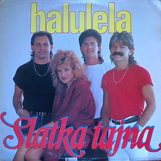
Neon lettering, studio haze, and a carefully arranged lineup of bandmates announce the era before you even read the title: “halulela” hovering overhead and “Slatka tajna” sweeping across the bottom in flamboyant script. The design leans hard into high-contrast colors and oversized type, letting the text compete with the portrait instead of supporting it. That crowded, loud-first approach is exactly the kind of visual bravado that makes Yugoslavian album art from the 1970s and 1980s so fascinating—and so easy to call “ugly” at first glance.
Fashion does most of the storytelling here: big hair, strong shoulder silhouettes, tight tees, chains, and a confident mustache-and-mullet energy that plants the cover firmly in late-socialist pop aesthetics. The performers are posed like a family portrait reimagined as a nightclub poster, with glossy styling and a slightly awkward depth that hints at quick studio sessions and limited art-direction time. Rather than aiming for subtle symbolism, the cover sells personality, immediacy, and a promise of catchy hooks—more variety-show charisma than rock mystique.
What looks kitschy now also reads like a record-industry snapshot from a place where Western trends filtered in unevenly, then got remixed into something local and unabashedly direct. The mixed fonts, saturated palette, and photo-forward layout reflect an economy of tools—simple photography, bold typography, and the belief that bigger meant better on a shop wall. If you’re exploring Yugoslavian cover art, ex-Yu pop culture, or the quirks of 1970s and 1980s graphic design, this sleeve is a perfect example of how “bad taste” can become an honest document of its time.