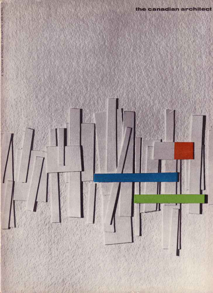
Against a softly textured grey field, the April 1965 cover of *The Canadian Architect* arranges slim white panels like a clustered skyline, their shadows giving the composition a quiet sense of depth and rhythm. Three crisp bars—blue, green, and a small red block—cut across the midsection, lending a mid-century modern punch of color that feels both graphic and architectural. Even at a glance, the design reads as an editorial statement: abstraction standing in for the built environment.
What makes this cover art so compelling is its balance between order and improvisation, as if cardboard model pieces were pinned in place just before a critique. The verticals lean and overlap, suggesting movement without becoming chaotic, while the restrained palette keeps the eye focused on structure, proportion, and light. It’s a small lesson in how 1960s architectural culture often communicated big ideas—modernism, urban growth, and new materials—through clean, experimental visual language.
For collectors, designers, and architecture enthusiasts, this historical magazine cover offers a vivid snapshot of Canadian architectural publishing in the mid-1960s. The clear title at the top right and the prominent “April 1965” context in the post name make it an easy reference point for anyone searching for *The Canadian Architect* archives, vintage cover design, or modernist graphic inspiration. As a WordPress feature image, it brings a period-accurate elegance that still feels surprisingly contemporary.