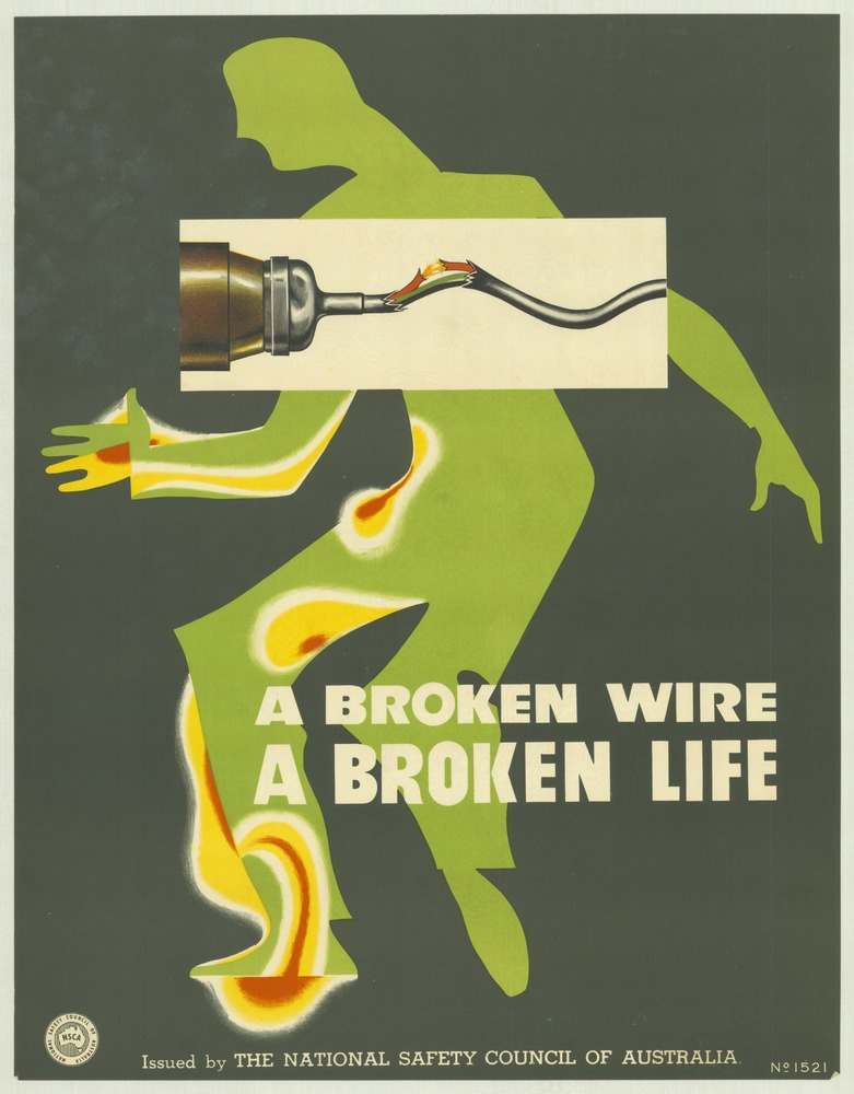
Bold graphic design does the talking here: a vivid green human silhouette staggers across a dark field while a severed electrical lead spits color like heat and danger. The slogan, “A BROKEN WIRE A BROKEN LIFE,” lands in heavy white type, turning a simple maintenance failure into a stark warning about what can happen in a split second. Issued by the National Safety Council of Australia, the poster uses minimal detail and maximum contrast to make the hazard impossible to ignore.
Rather than relying on long explanations, this 1970s safety poster communicates through symbolism—an anonymous figure, a single faulty connection, and the suggestion of injury traced along the body. The composition reads instantly, even at a distance, which is exactly how workplace and public safety messaging had to function on walls, noticeboards, and corridors. It’s a clear example of how the era’s visual language fused public health advocacy with modernist advertising techniques.
Placed within a collection of National Safety Council of Australia posters from the 1970s, this cover art highlights the period’s focus on accident prevention and personal wellbeing through memorable visual messages. For readers interested in Australian social history, occupational safety, or vintage poster art, the design offers a window into how institutions tried to shape everyday behavior—by making risk feel immediate, personal, and unforgettable.