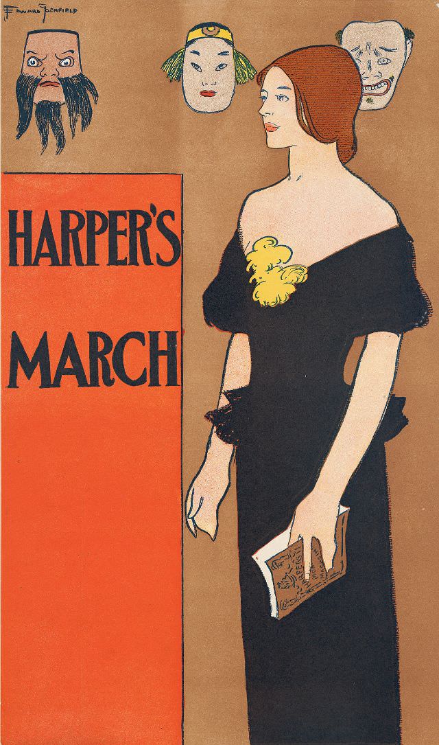
Against a warm, minimalist background, a poised woman in a dark, off-the-shoulder gown turns in profile while holding a magazine at her side, her gloved hand and neat hairstyle underscoring a polished, late‑19th‑century elegance. The bold block lettering reading “Harper’s March” anchors the design like a poster, balancing fashion illustration with the graphic punch of period print culture. Subtle color contrasts—deep black fabric, pale skin tones, and a striking yellow accent at the bodice—give the cover a crisp, modern feel despite its 1890s origin.
Above her, three theatrical masks hover like a chorus: one bearded and severe, one smooth and stylized, and one with a tense, comic grimace. Their placement suggests performance and shifting identities, inviting viewers to read the figure below as both spectator and participant in the era’s fascination with stagecraft, society roles, and public image. The interplay between calm posture and expressive masks creates a quiet tension that makes the composition memorable at a glance.
Harper’s magazine cover art from March 1896 offers a window into how illustrated periodicals sold culture as much as they sold reading material—mixing typography, fashion, and symbolism to catch the eye on a crowded newsstand. For collectors and researchers, details like the limited palette, confident linework, and theatrical motif speak to the aesthetics of magazine illustration at the end of the nineteenth century. As a WordPress feature image or archival post, it’s an SEO-friendly centerpiece for topics such as Harper’s history, Victorian-era fashion in print, and the visual language of theatre masks in American illustration.