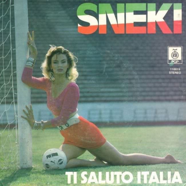
Neon sports glamour collides with pop bravado on this cover for SNEKI, where a posed figure stretches against a football goalpost while a Puma ball anchors the scene in unmistakable late-20th-century style. The loud, blocky title lettering and saturated color palette do more than sell a record—they broadcast an era’s idea of modernity, confidence, and mass-market appeal. Even before you hear a note, the composition signals “hit single energy,” borrowing from advertising and pin-up photography as much as from music culture.
Yugoslav album art in the 1970s and 1980s often lived in that uneasy space between ambition and awkwardness, and that tension is exactly what makes it so fascinating today. Designers and labels chased Western visual trends—sporty chic, disco gloss, bold typography—while working within local print limitations and a rapidly shifting pop landscape. The result could be striking, funny, or unintentionally uncanny, and it’s that mix of sincerity and spectacle that fuels conversations about “ugly” cover art long after the records left the shop racks.
Look closely and you can read the marketing logic: a dramatic pose, a lifestyle setting, and a punchy title like “TI SALUTO ITALIA” aimed at aspiration and mobility rather than subtle storytelling. For collectors, graphic designers, and fans of Balkan pop history, this is a perfect artifact to discuss Yugoslavian cover art aesthetics, retro typography, and the visual language of mainstream entertainment. Love it or cringe at it, the cover does its job—stopping the scroll and inviting you into the strange, bright world of 1970s–1980s Yugoslav pop design.