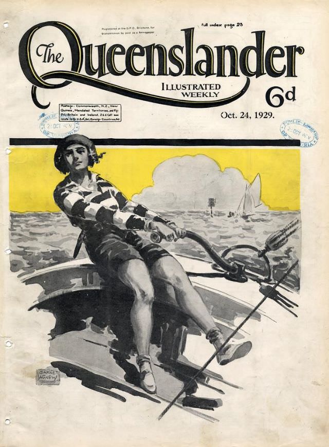
Bold typography crowns the page with “The Queenslander” and its promise of an illustrated weekly, dated Oct. 24, 1929, priced at 6d. Beneath the masthead, a dynamic cover artwork bursts into view: a lone rower leans back against the pull of the oars, legs braced, body turned with effort and rhythm. The scene reads instantly as a celebration of motion, modern leisure, and the magazine’s knack for pairing reportage with striking visual design.
Colour does much of the storytelling here, with a warm yellow sky washing over an otherwise monochrome seascape, making the figure and the choppy water feel even more dramatic. In the distance, small sailboats and a low cloud bank hint at a breezy day on the bay, while the boat’s sharp angles and the rower’s patterned top bring a graphic, almost poster-like punch. Even the visible postal markings and aged paper add texture, reminding viewers that this was once a handled, circulated object—not just an image.
As an illustrated front cover from The Queenslander, this piece offers more than “Cover Art”; it reflects how Australian magazines of the era used bold illustration to sell a mood as much as a story. The emphasis on sport and outdoor vitality fits neatly with the late-1920s appetite for recreation and modern style, while the clean layout around the central image keeps the focus on the drama of the stroke. For collectors and historians alike, it’s a vivid snapshot of print culture in 1929 and a handsome example of period magazine cover design in Queensland.