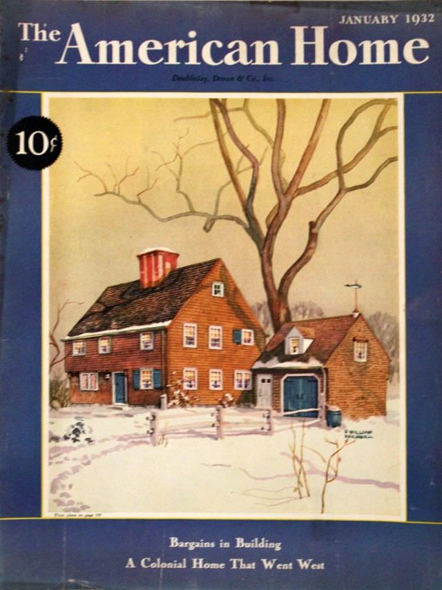
January 1932 sits at the top of this *The American Home* cover, framed in deep blue with the bold magazine masthead and a clear 10¢ price tag. The design feels purposeful and optimistic, offering readers an inviting promise of domestic stability at the start of a new year. Even the small lines of cover text hint at practical concerns and aspirations—building, budgeting, and the enduring appeal of traditional architecture.
At the center, an illustrated house rests under a pale winter sky, its warm clapboard siding and steep roofline standing out against fresh snow. Blue shutters and a matching blue garage door add crisp contrast, while a tall, leafless tree stretches across the scene like a quiet sentinel. A low fence cuts across the foreground, and the snowy path and soft shadows give the artwork a lived-in, homely realism rather than a purely decorative façade.
Looking closely, the cover art doubles as a time capsule of early-1930s American taste: Colonial-inspired lines, tidy proportions, and a preference for comfort over flash. For collectors of vintage magazine covers, home design history enthusiasts, or anyone researching period illustration, this issue presents a snapshot of how “home” was marketed and imagined in the era. As a piece of print culture, it also shows how publishers used seasonal imagery—snow, bare branches, warm interiors implied—to sell the idea that good design could make even the cold months feel secure.