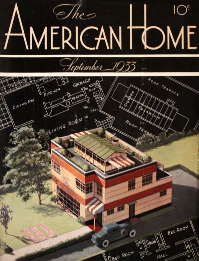
Bold lettering and elegant script announce *The American Home* for September 1933, priced at ten cents, setting a confident tone at the top of the cover. Beneath the masthead, crisp white drafting lines spread across a dark field like an architect’s blueprint, labeling everyday spaces—living room, dining room, kitchen, garage, and roof terrace—so the reader is invited to “read” the house before ever stepping inside. The design balances glamour and practicality, turning floor plans into a graphic backdrop for the featured dwelling.
In the foreground, a streamlined modern home rises in clean horizontal bands, with a flat roof, generous windows, and striped awnings that suggest shade, leisure, and warm-weather living. The roof terrace—called out again in the plan—feels like the star feature, a promise of outdoor space elevated above the street. A neatly kept yard, a tree for scale, and a parked automobile complete the scene, situating the architecture in the rhythms of ordinary American life while still selling a distinctly up-to-date ideal.
As cover art from the early 1930s, this piece makes a compelling snapshot of how magazines promoted domestic aspiration through modern design and accessible instruction. The combination of illustration and architectural diagram functions almost like a mini portfolio, offering both curb appeal and a peek at layout logic for homeowners, builders, and dreamers. For readers interested in vintage magazine covers, home design history, and 1930s modern architecture, this *American Home* cover remains a striking example of optimism rendered in lines, color blocks, and carefully labeled rooms.