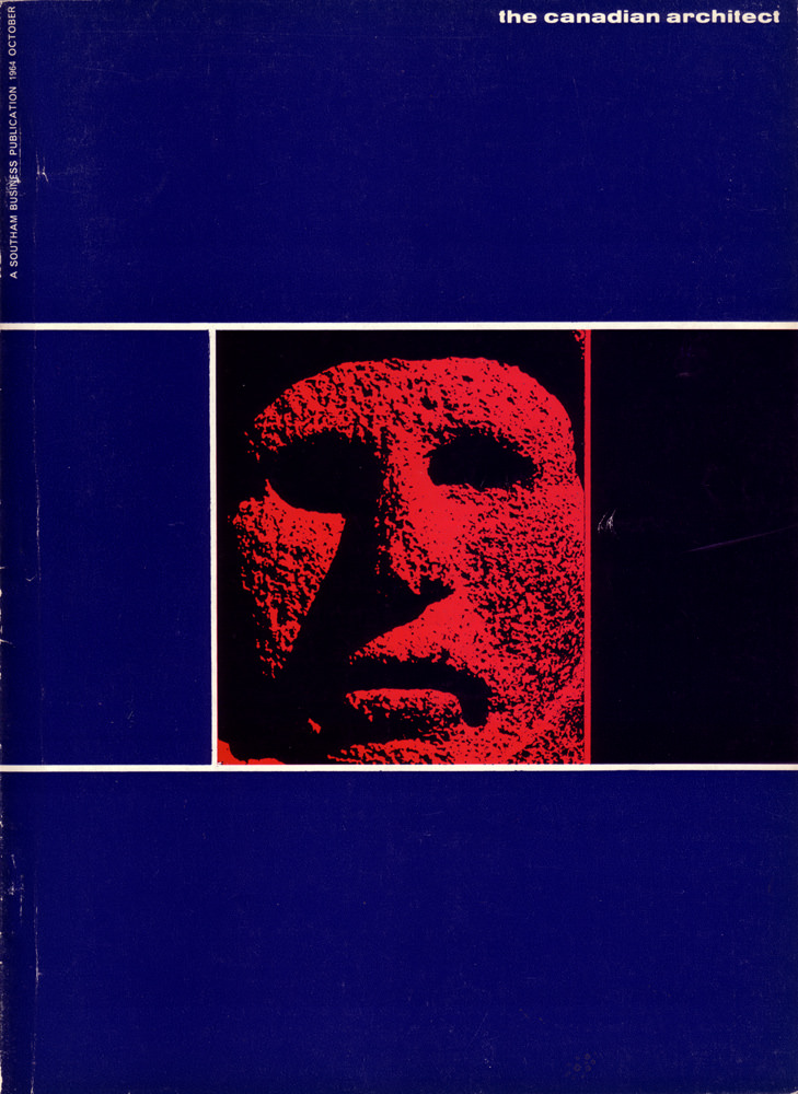
Bold blocks of deep blue and a razor-straight white grid frame a startling red relief face on the cover of *The Canadian Architect* (October 1964). The design leans into mid-century modern graphic language—high contrast, hard edges, and a deliberately limited palette—so the viewer’s attention lands immediately on texture and shadow. Even in a still cover image, the composition feels architectural, like a façade reduced to planes, openings, and a single commanding focal element.
Across the top, the magazine title sits cleanly in lowercase, while the left margin carries vertical publication text that reinforces the era’s disciplined typographic choices. The cropped visage, treated like stone or cast concrete, reads as both human and monumental, echoing the 1960s fascination with sculpture, material honesty, and modernism’s public presence. The slight wear and scuffing visible on the surface adds a quiet archival authenticity, reminding us this is a handled object from a working professional world.
As cover art, this October 1964 issue offers more than a striking graphic—it’s a snapshot of how Canadian architecture culture presented itself in print, balancing cool rational structure with a provocative, almost cinematic image. For collectors, designers, and historians searching for *The Canadian Architect* magazine cover, this piece captures the look and mood of the period with clarity and restraint. It stands as a compact artifact of 1960s editorial design, where typography, geometry, and material imagery met on the newsstand.