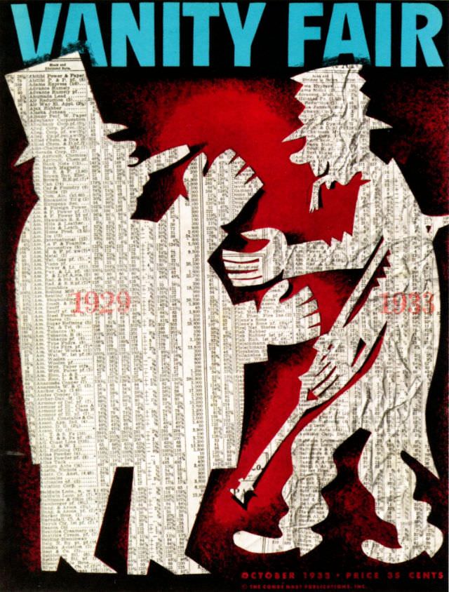
Bold turquoise lettering crowns the October 1933 Vanity Fair cover, immediately framing a tense, theatrical scene rendered in stark silhouettes. Two towering figures, built from dense columns of tiny printed listings, close in around a smaller character whose body language suggests strain and resistance. Against a deep red ground, the angular hands, bent knees, and clenched posture turn the composition into a visual drama rather than mere decoration, pulling the eye from the masthead down into the struggle.
Numbers ghosted across the paper-text bodies read “1929” and “1933,” letting the art speak in shorthand about an era of upheaval without a single captioned explanation. The use of stock-listing-like typography as texture is especially pointed: it makes finance feel physical, heavy, and unavoidable, as if the world of figures and quotations has taken human form. The limited palette—black, white, and red—amplifies the emotional temperature, balancing modernist design with a clear editorial punch.
For collectors of magazine cover art and historians of graphic design, this Vanity Fair October 1933 cover stands as a memorable example of how illustration could comment on contemporary life with wit and bite. It also offers strong SEO-friendly appeal for searches related to 1930s magazine covers, Depression-era visual culture, and classic Vanity Fair artwork. Even at a glance, the cover’s symbolism and typography-driven collage invite a longer look, rewarding anyone interested in the intersection of publishing, art, and economic history.