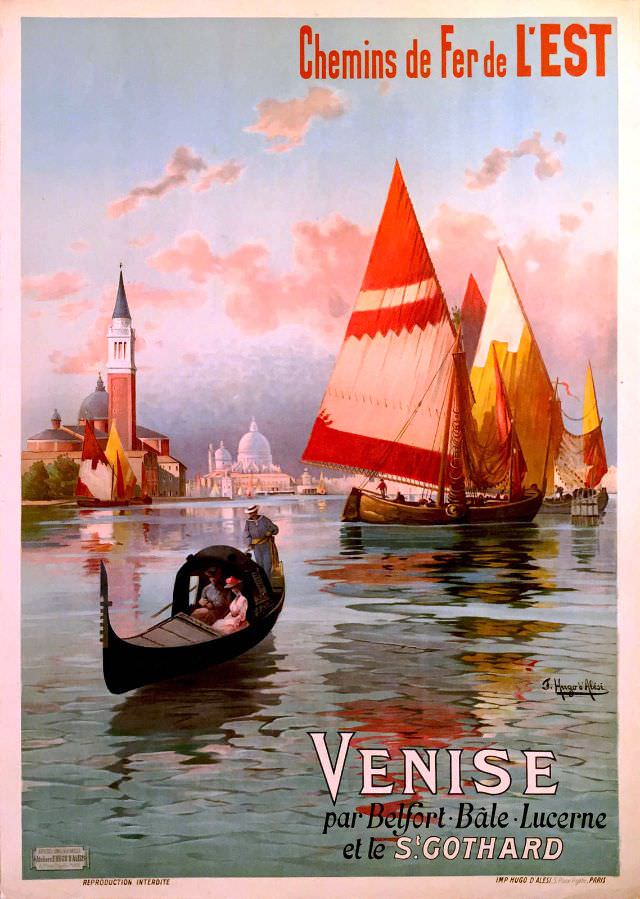
Warm Venetian light spills across calm water in this circa-1890s cover art, where a gondola glides in the foreground and tall, vividly colored sails catch the breeze beyond. The composition leans into atmosphere—pink clouds, shimmering reflections, and a skyline of domes and towers—inviting the viewer to linger in a romantic vision of the lagoon. Even without a precise scene pinned to one canal, the poster’s details unmistakably signal the city’s iconic maritime character.
Above the horizon, the bold French headline “Chemins de Fer de L’EST” frames the artwork as more than a souvenir: it is a travel advertisement, designed to sell the idea of Venice as a reachable destination. The title, “Venise par Belfort, Bâle, Lucerne et le St. Gothard,” reads like an itinerary, hinting at a rail journey that threads from eastern France into Switzerland and through the St. Gotthard route before arriving at Italy’s storied city. In the late nineteenth century, such posters helped transform long-distance travel into a curated experience—part timetable, part dream.
Rich in period typography and painterly color, this historic poster makes an appealing WordPress feature for readers interested in railway history, European tourism, and Belle Époque graphic design. Its clean, legible text and evocative maritime imagery work well for SEO topics like vintage travel poster, Venice railway route, and 1890s advertising art. As cover art, it stands on its own—selling motion, modernity, and the promise of Venice in a single, luminous scene.