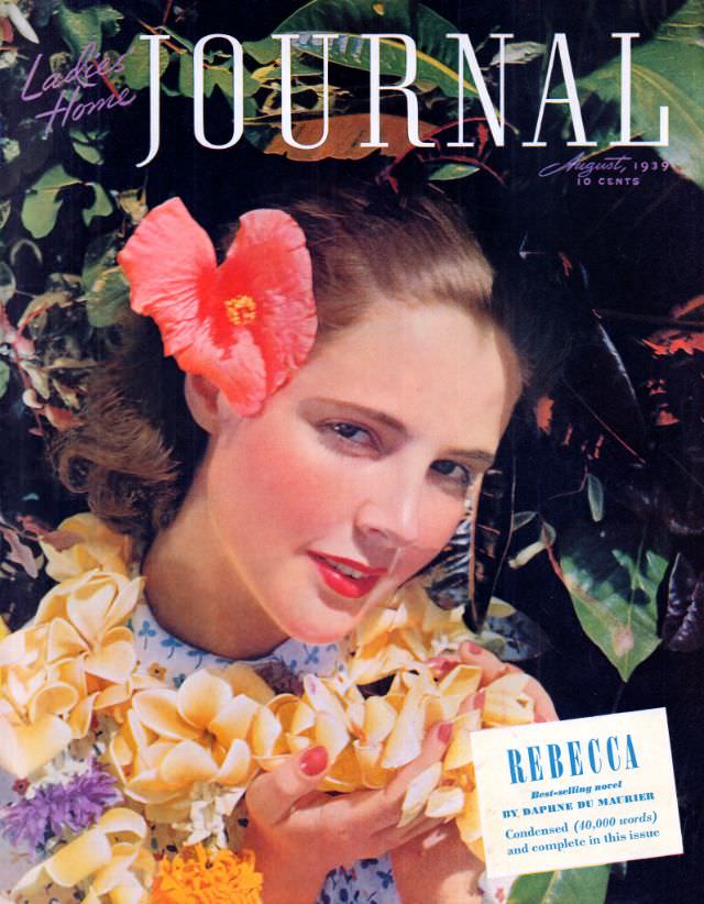
Against a lush backdrop of glossy leaves, the August 1939 cover of *Ladies’ Home Journal* leans into saturated color and summer glamour, with the magazine’s tall, elegant masthead stretching across the top. A poised young woman meets the viewer with a calm, direct gaze, a vivid hibiscus tucked behind her hair like a tropical accent. The composition is intimate—face, flower, and foliage pulled close together—creating the kind of inviting immediacy that made classic magazine cover art so memorable on the newsstand.
Details do much of the storytelling here: bright red lipstick, softly styled hair, and an armful of pale blossoms that read as leis or gathered garden flowers, all rendered with the smooth finish of high-quality period printing. The contrast between warm skin tones and deep greens gives the image a cinematic richness, while the framing suggests leisure, travel-daydreaming, and cultivated beauty—themes long associated with women’s magazines of the era. Even the small cover lines and price mark anchor it firmly as an artifact of everyday publishing, not just a standalone portrait.
For collectors of vintage magazines, Golden Age illustration, and pre-war American print culture, this *Ladies’ Home Journal* cover offers a vivid snapshot of late-1930s visual style and marketing appeal. It’s also a strong reference point for historians interested in how fashion, cosmetics, and ideals of femininity were presented to mass audiences through glossy periodicals. Whether you’re researching magazine design or simply drawn to classic cover art, August 1939 remains a striking example of how color and close-up portraiture could sell an entire season in a single image.