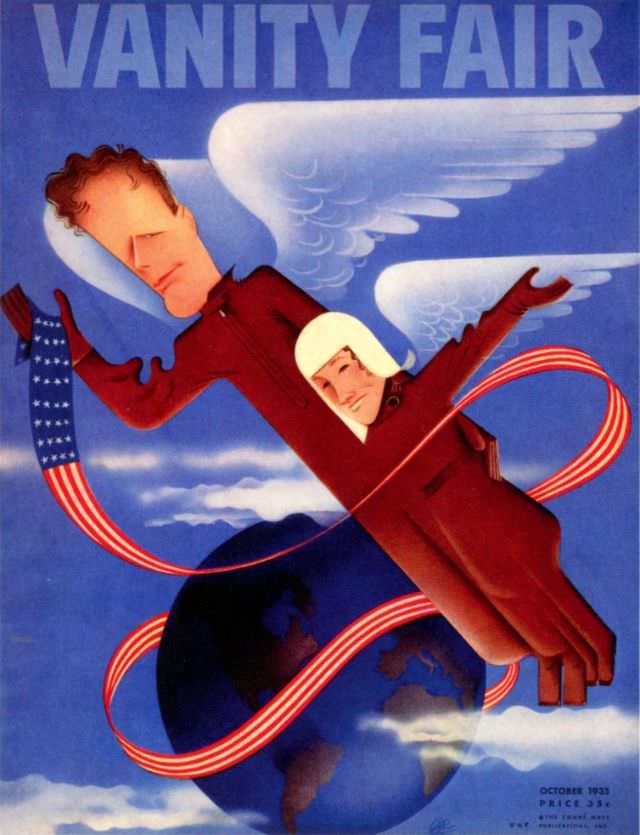
Bold, streamlined lettering announces “VANITY FAIR” across a cool blue sky, setting the stage for a whimsical October 1935 cover that leans into Art Deco modernity. Two figures in a single, deep-red flying suit glide diagonally through clouds, their simplified faces and long, elegant lines emphasizing speed and confidence. White wings flare behind them, while the saturated palette keeps the design crisp and instantly readable—perfect for a magazine cover meant to stop passersby.
A looping ribbon in American flag colors whips around the composition like a contrail, curling past a darkened globe below and hinting at air travel’s expanding reach. The globe’s continents are rendered as shadowy silhouettes, more suggestion than geography, giving the artwork a timeless, symbolic feel rather than tying it to one place. Between the winged imagery and the sweeping red-and-white curves, the cover celebrates motion, ambition, and the romance of the skies.
As historical cover art, this Vanity Fair October 1935 design offers a vivid snapshot of interwar visual culture, when aviation and international connection were selling points as much as style itself. The illustration balances satire and glamour—exaggerated proportions, theatrical gestures, and a polished finish that feels both playful and aspirational. For collectors, designers, and magazine-history readers, it’s a striking example of 1930s editorial illustration and the era’s fascination with modern flight.