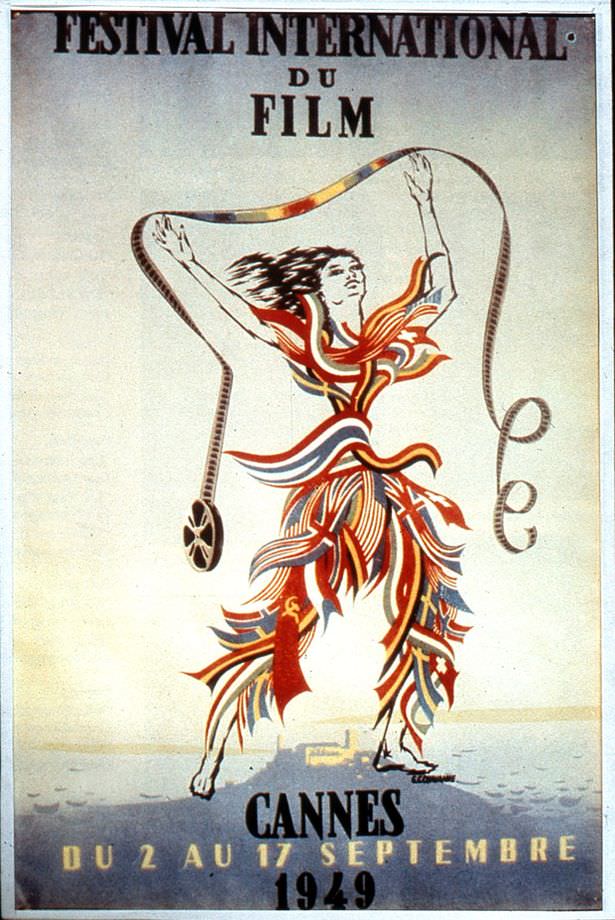
Bold letters at the top announce “Festival International du Film,” while the lower edge anchors the design with “Cannes” and the year 1949, framing a piece of cover art that doubles as a promise: the festival has returned. After the previous year’s absence, the poster reads like a public declaration that cinema—and the civic pride wrapped around it—was ready to step back into the spotlight. Even without knowing the behind-the-scenes budgeting headaches, the typography and confident layout sell the idea of continuity and prestige.
At the center, a stylized figure strides forward with arms raised, ribbons of red, white, and blue streaming around the body in an energetic swirl that suggests celebration, movement, and spectacle. A strip of film loops like a gymnast’s ribbon, creating an unmistakably Olympic-style flourish that feels both ambitious and a little cheeky—exactly the “slightly dubious” tone hinted at in the title. The pale background and minimal scenery keep the focus on the graphic performance, turning cinema itself into a kind of athletic triumph.
Anyone interested in Cannes Film Festival history, vintage film posters, or mid-century graphic design will find plenty to linger over here, from the propaganda-like optimism to the playful fusion of sport and screen culture. The poster’s French wording and prominent festival branding make it a useful visual reference for how post-war cultural events marketed themselves to international audiences. As an artifact, it captures not just an event’s return, but the determination to look grand—perhaps even grander—after a year when there simply wasn’t enough money to put on the show.