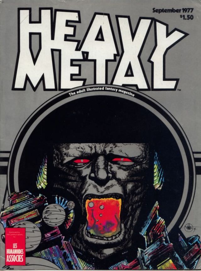
Bold block lettering shouting “HEAVY METAL” crowns the cover, with the tagline “The adult illustrated fantasy magazine” tucked beneath it like a dare. In the corner, “September 1977” and the price “$1.50” anchor the piece in its era, when newsstands still served as galleries for boundary-pushing sci‑fi and fantasy art. Even before the illustration pulls you in, the typography and layout signal the magazine’s intent: loud, graphic, and unapologetically futuristic.
Down in the central frame, a hulking, gorilla-like face glares out with unnerving red eyes, its mouth opened wide around a glowing, liquid-like form that reads as equal parts cosmic and visceral. Jagged, neon-streaked structures crowd the bottom edge, suggesting alien cityscapes or crystalline wreckage, while a few pale, spherical forms float like moons or drifting machines. The limited palette—hard blacks, hot reds, and electric accents—delivers that classic 1970s punch, where fantasy illustration leaned into high contrast and surreal menace.
Collectors and design lovers return to Heavy Metal magazine covers for this exact blend of pulp energy and sophisticated draftsmanship, a snapshot of how sci‑fi imagery evolved from paperback rack art into countercultural iconography. The issue’s clean metadata at the top makes it especially useful for anyone researching vintage magazine cover art, retro graphic design, or the rise of adult-oriented fantasy illustration in the late 1970s. As a historical artifact, it’s more than “cover art”—it’s a loud little portal into the visual imagination of the era.