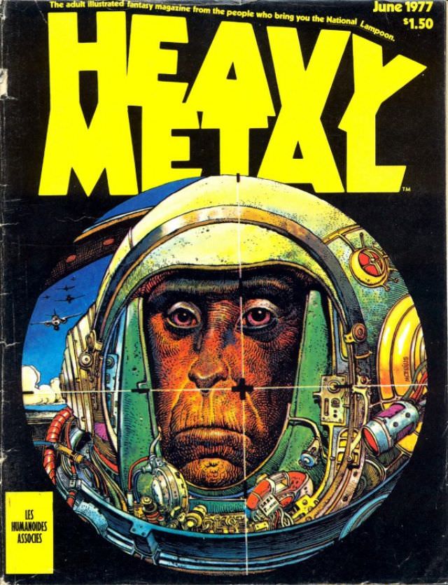
Towering yellow lettering shouts “HEAVY METAL” across a dark field, framing a striking, almost confrontational helmeted face rendered in dense, crosshatched color. The visor becomes a window into 1970s sci‑fi illustration—worn metal textures, wires, and tiny mechanical fittings crowd the margins, while a crosshair-like mark centers the gaze. In the corner, the cover’s own ephemera—“June 1977” and a $1.50 price—anchors the artwork in the era of newsstands and glossy fantasy magazines.
The astronaut motif here isn’t the clean, heroic space-age optimism of earlier decades; it feels heavier, grimier, and more intimate, as if the machinery is as much burden as protection. Specks of patina and scratches suggest use and danger, and the face—half shadowed, half lit—reads like a portrait of endurance rather than triumph. Even the small burst of blue at left hints at distance and motion, making the helmet’s enclosed world feel claustrophobic by comparison.
For readers hunting Heavy Metal magazine covers, this piece is a compact lesson in why the publication became synonymous with adult science fiction and fantasy cover art: bold typography, airbrushed glow, and meticulous tech detail fused with a human, almost weary expression. It’s the kind of cover that would stop someone at a spinner rack, promising strange worlds inside while advertising the craft of illustration as the main event. As a historical artifact, it also preserves the look of 1970s genre culture—when magazine covers served as galleries, gateways, and provocations all at once.