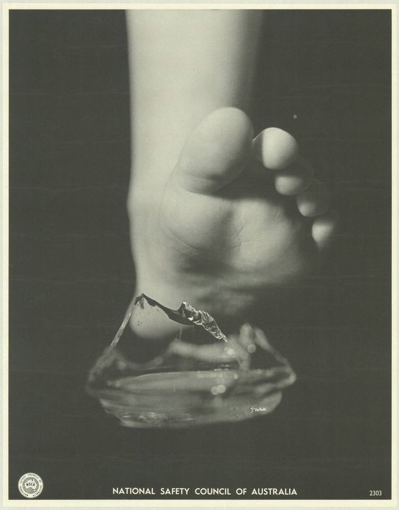
A child’s bare foot hovers above a jagged shard of broken glass, the sharp edge turned into a simple, unforgettable warning. The stark black-and-white composition keeps the focus on texture and danger—soft skin, hard angles, and the split second before injury. Along the bottom margin, the “National Safety Council of Australia” imprint anchors the scene as a piece of public safety communication rather than mere studio drama.
Posters like this from the 1970s relied on visual impact more than lengthy instruction, translating everyday hazards into images that could stop passersby in their tracks. The close-up framing suggests a domestic setting where accidents happen quickly—at home, around children, and often without witnesses. By choosing a universal moment instead of a specific place or person, the message becomes broadly Australian and broadly human: prevention starts with noticing what’s underfoot.
As cover art for this collection, the design reflects how the National Safety Council of Australia used photography to shape attitudes toward health and safety, whether in households, schools, or workplaces. The minimal typography and heavy negative space feel deliberate, giving the viewer nowhere to look but the risk itself. For readers interested in 1970s Australian graphic design, safety posters, and the history of public awareness campaigns, this image offers a clear window into the era’s persuasive visual language.