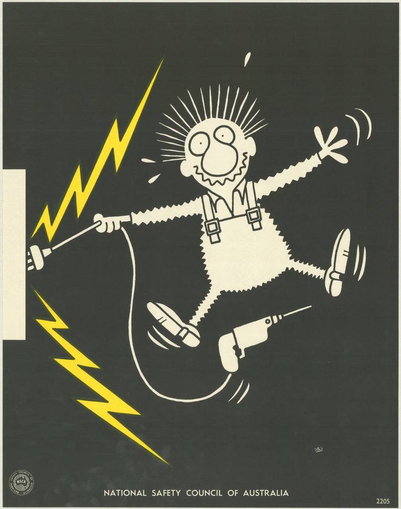
Bold cartoon drama does the talking on this cover art from the National Safety Council of Australia’s 1970s safety poster campaign. Against a deep black field, a wide-eyed worker in overalls flails mid-step as jagged yellow lightning bolts crackle nearby, turning a simple scene into an instant warning about electrical danger. The pared-back palette and thick linework make the message legible from a distance, a hallmark of public safety design meant for factories, worksites, and community noticeboards.
Humour and alarm sit side by side here: the character’s spiky hair and startled expression convey the shock in a split second, while the exaggerated pose keeps the image memorable without needing a lot of text. A loose cord and plug, a tool on the floor, and the surrounding “electric” zigzags suggest how quickly routine tasks can become hazardous when wiring, power points, or equipment aren’t handled with care. It’s a visual shorthand for occupational health and safety—simple, direct, and hard to ignore.
As part of a broader set of National Safety Council of Australia posters, this piece offers a window into how the 1970s communicated risk through graphic design. The minimal wording and strong iconography reflect an era when safety education relied on quick recognition and repeated exposure, reinforcing safe work practices through striking imagery. For collectors, designers, and historians of Australian public campaigns, it’s a vivid example of how visual messages were crafted to keep people safe and well.