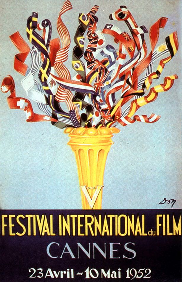
A golden torch rises from the bottom of the poster, erupting into a jubilant spray of ribbon-like national flags that twist and curl against a pale blue sky. The design leans into the clean, athletic symbolism of an international gathering—part ceremonial flame, part celebratory bouquet—giving it that unmistakable “Olympics advert” energy mentioned in the title. Bold typography anchors the composition with “Festival International du Film” and “Cannes,” making this cover art instantly legible even at a distance.
Down at the base, the dates “23 Avril – 10 Mai 1952” quietly underline the bigger story: the Festival’s move from September to April to catch the start of the tourist season. It’s a savvy piece of cultural marketing, selling not just cinema but a sense of springtime arrival and cosmopolitan momentum. The torch motif does the persuasive work of promising spectacle, unity, and prestige—exactly the qualities a film festival wants visitors to associate with its opening nights.
Graphic poster collectors and Cannes Film Festival historians will appreciate how this mid-century style balances exuberance with restraint: limited text, strong color contrasts, and an emblem-like centerpiece built for reproduction. The hand-drawn signature at the lower right adds a personal touch without distracting from the message. As an artifact of 1952 festival publicity, it’s both a time capsule of design trends and a reminder that international film culture has long borrowed the visual language of global sport to announce itself to the world.