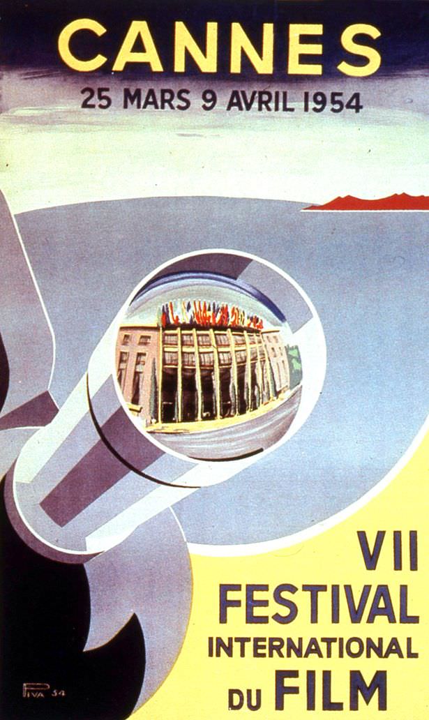
Bold lettering announces “CANNES” above the dates “25 MARS 9 AVRIL 1954,” setting the tone for a piece of mid-century festival design that feels both official and playful. The composition leans into modernist geometry: sweeping blocks of color, a simplified emblem-like form, and a circular “window” that frames a seaside façade lined with flags, as if the town itself has been placed under a spotlight.
Instead of the palm leaf that would soon become inseparable from the Cannes Film Festival identity, the poster doubles down on a seafaring, almost martial visual language—curving shapes that suggest a prow, a periscope, or a viewing instrument trained on the Riviera. That tension is the charm of this 1954 cover art: it sits at the moment when branding was crystallizing, yet the imagery still experimented with metaphor, spectacle, and the promise of international cinema.
For collectors and film-history readers, the appeal lies in the details printed right on the design—“VII FESTIVAL INTERNATIONAL DU FILM”—and in how confidently it sells Cannes as an event before the now-familiar palm motif took over trophies and iconography. As a historical Cannes poster, it’s a crisp reminder that festival aesthetics evolve: logos are born, symbols become tradition, and sometimes the official artwork takes a different route while the emblem quietly finds its way into permanence.