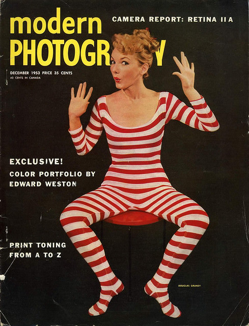
Bold typography and playful studio theatrics leap off this Modern Photography cover, where a model in red-and-white stripes poses against a deep black background with palms raised as if caught mid-performance. The high-contrast design, paired with the oversized “modern” and “PHOTOGRAPHY” masthead, embodies mid-century magazine cover art at its most attention-grabbing—clean, graphic, and made to pop on a newsstand.
Printed cover lines anchor the moment in the era’s photographic conversations, calling out a “Camera Report: Retina II A,” an “Exclusive! Color Portfolio by Edward Weston,” and practical guidance like “Print Toning from A to Z.” Even the small-print details—price, month, and the carefully arranged hierarchy of text—suggest a publication balancing glamour and instruction, appealing to both enthusiasts chasing new gear and artists following the evolving language of modern photography.
For collectors and design lovers, this is a striking example of 1950s–1960s magazine cover aesthetics: minimal set, strong color, and a confident, almost stage-like pose that turns the cover into a mini poster. As a look back at vintage Modern Photography magazine covers, it highlights how editorial art direction helped shape the public’s idea of what “modern” looked like—sleek, witty, and unmistakably of its time.