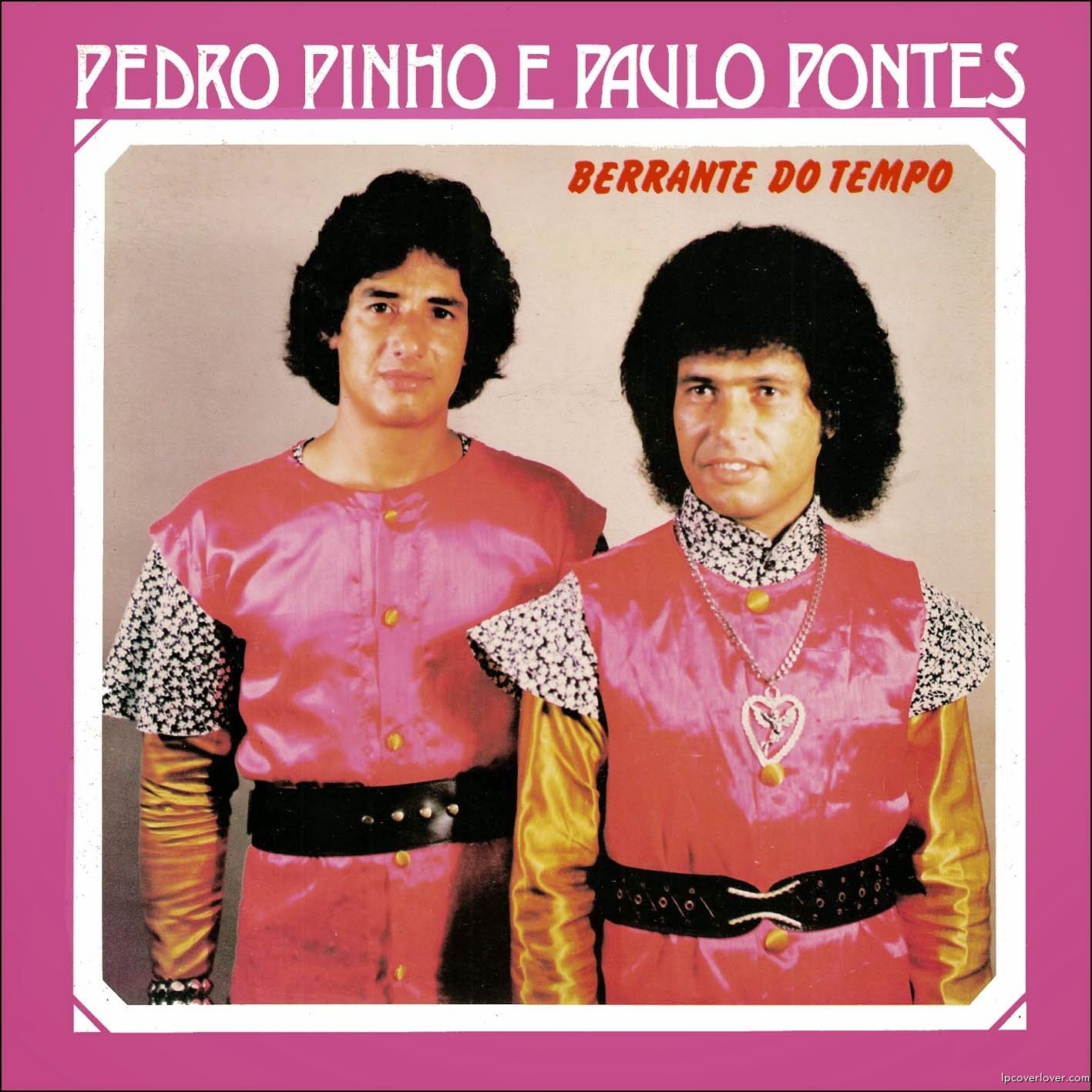
Front and center, the duo pose with total sincerity beneath the bold lettering “PEDRO PINHO E PAULO PONTES,” while the album title “BERRANTE DO TEMPO” sits above them like a dramatic promise. The design leans hard into high-contrast color: a magenta border, a plain studio backdrop, and matching glossy outfits that pop so loudly they practically become the background. It’s the kind of vintage album cover art that feels both earnest and accidentally hilarious—exactly the sweet spot for “so bad, they’re good” collectors.
Their styling is pure time capsule: thick, carefully shaped hair, patterned sleeves, wide belts, and a statement necklace that turns the closer figure into the undeniable focal point. Nothing in the composition is subtle, from the shiny fabric to the strong front-facing pose, and that unwavering confidence is what makes the cover so memorable. Even if you don’t know the music, the visual language speaks clearly—showmanship, partnership, and a belief that bigger is better.
For anyone hunting for funny vintage album covers, this one is a perfect example of how design trends can age into unintentional comedy without losing their charm. The typography, the color choices, and the studio-portrait simplicity all hint at an era when record sleeves doubled as bold identity posters. Add it to your gallery of ridiculous retro cover art, and it’ll do what the best “bad” covers always do: make you laugh, then make you look closer.