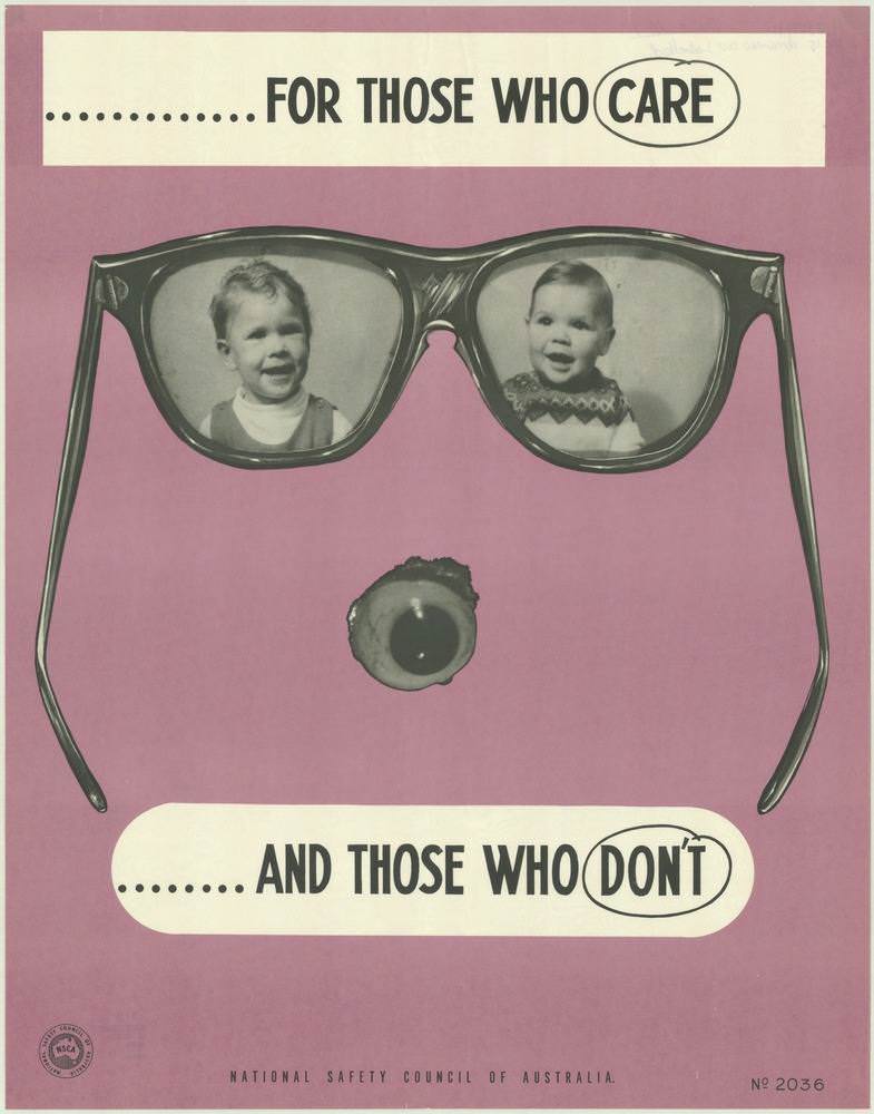
Bold, graphic design does the talking here: a pair of oversized glasses frames two smiling children like treasured memories, while a single detached eye below turns the composition into an unsettling warning. Across the top and bottom, the blunt slogan “FOR THOSE WHO CARE … AND THOSE WHO DON’T” lands with the kind of sharp, public-service clarity that defined many 1970s safety campaigns. The poster’s spare palette and strong contrasts make it instantly readable, even at a glance—exactly what a National Safety Council of Australia message needed in busy public spaces.
Looking closer, the imagery plays on responsibility and consequences without relying on gore or detailed narrative. The children’s portraits suggest what’s at stake—family, wellbeing, the future—while the lone eye evokes vulnerability and irreversible loss. By placing warmth and threat within the same visual field, the design pulls viewers into a moral choice: care enough to prevent harm, or risk paying the price for neglect.
As cover art for a collection of National Safety Council of Australia posters from the 1970s, this piece highlights how visual messaging shaped everyday attitudes toward safety and health. It’s a reminder that workplace safety, road awareness, and injury prevention were communicated not just through rules, but through memorable symbols engineered to stick in the mind. For anyone researching Australian public health history, vintage graphic design, or the evolution of safety education, this poster offers a striking entry point into an era of persuasive, no-nonsense communication.