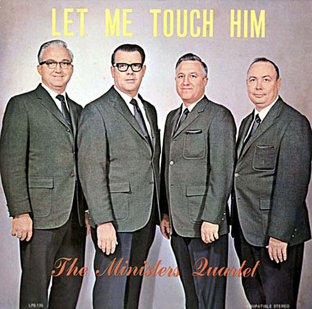
Bold lettering at the top declares “LET ME TOUCH HIM,” a phrase that lands very differently today than it likely did when this promotional image was designed. Beneath it, four clean-cut men in matching suits pose with practiced seriousness, their tidy presentation and studio backdrop suggesting a wholesome, mainstream release meant for family living rooms rather than raised eyebrows.
The group name, “The Ministers Quartet,” anchors the intent in gospel tradition, where “touch” commonly meant spiritual help, healing, or divine presence. Yet the gap between earnest religious language and modern slang is exactly what makes old ads, comics, and catalog art such a rich hunting ground for accidental comedy—especially when a single line is isolated, enlarged, and paired with a straight-faced portrait.
Posts like this invite a second look at vintage marketing and the unintentional double meanings hidden in plain sight, where typography and phrasing can outlive their original context. If you enjoy retro ephemera, old-school humor, and the strange ways language evolves, this image is a perfect example of how yesterday’s innocent copy can become today’s punchline without changing a single word.