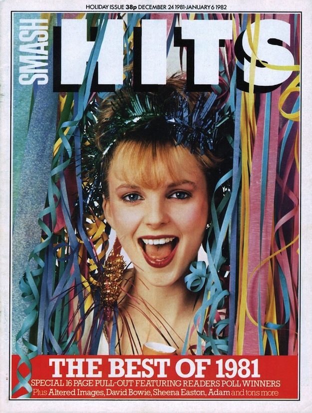
Confetti streamers tumble down the frame as the bold, blocky “HITS” masthead announces the unmistakable energy of Smash Hits at its peak. The cover leans into party-bright color and a close-up pop portrait, the kind of instantly readable design that made the magazine a newsstand magnet for fans of 1980s music culture.
A seasonal banner at the top marks it as a holiday issue spanning late December into early January, while the big red strip along the bottom shouts “THE BEST OF 1981.” It’s a smart bit of cover art storytelling: a celebratory look and a clear promise of a year-in-review package, complete with a “pull-out” feature and a crowded lineup of star names printed in small type to reward anyone who leans in.
Placed within a gallery of iconic 1980s magazine covers, this Smash Hits front page shows how pop journalism sold excitement as much as information. The mix of playful typography, saturated color, and festive styling speaks to the era’s graphic confidence—an approach that helped define classic UK music magazine design and still sparks nostalgia for collectors searching “Smash Hits cover art” and “best of 1981” issues today.