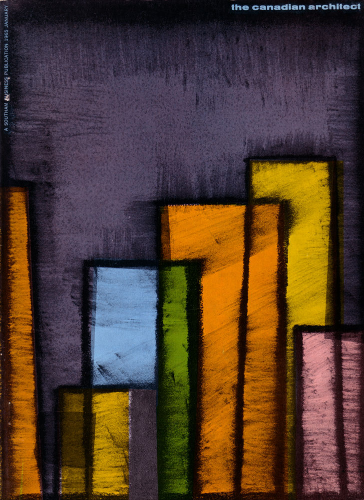
Bold blocks of colour rise against a smoky, textured ground on the January 1965 cover of *The Canadian Architect*, turning the magazine’s identity into a small piece of mid-century graphic design. Stacked rectangles—mustard, orange, lime, pale blue, and mauve—read like a simplified skyline, their dark outlines and soft, chalky edges suggesting both structure and handwork. The title sits quietly at the top, letting the composition do the talking.
Modernism often promised clarity, order, and progress, and this cover art nods to that mood without depicting any single building. The vertical forms feel architectural—towers, slabs, and façades—yet the rough surfaces and layered tones keep the image human and tactile rather than purely technical. In a single glance, it bridges the worlds of professional architecture publishing and the era’s abstract art.
For readers and collectors, this issue is a striking example of how Canadian architectural magazines presented themselves in the 1960s, when graphic experimentation and design culture were part of the conversation. It’s an eye-catching piece for anyone searching for “The Canadian Architect January 1965” cover art, mid-century modern magazine covers, or vintage architecture publication design. The image invites you to imagine the city not as a map of streets, but as rhythm, proportion, and colour.