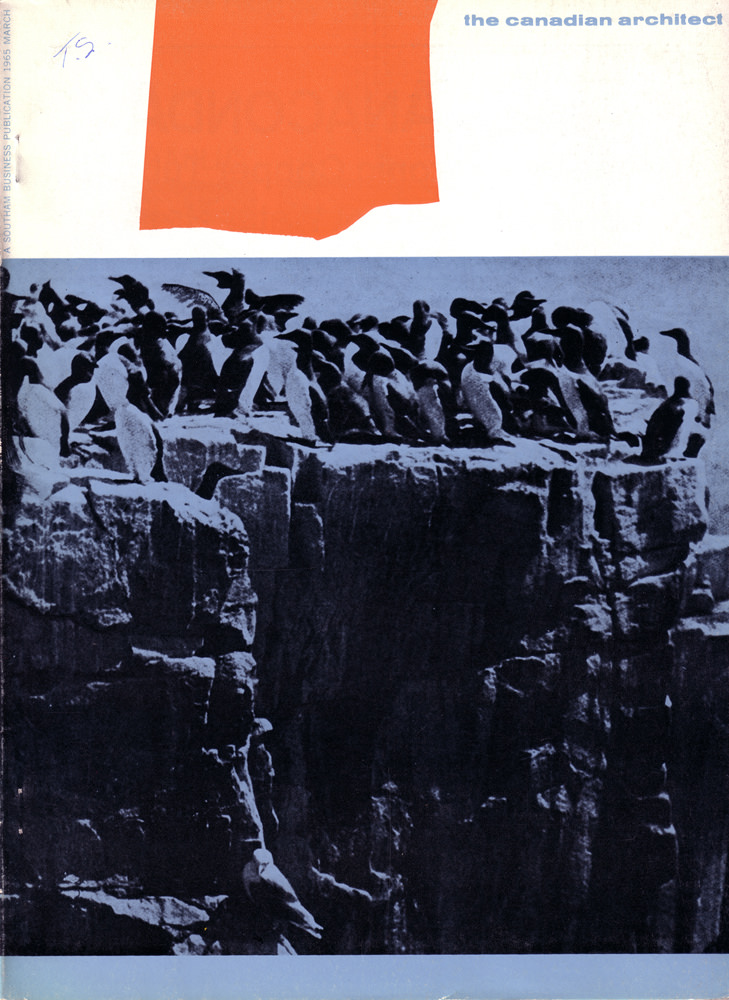
Bold graphic restraint meets raw nature on the March 1965 cover of *The Canadian Architect*. A flat field of red and a wide band of white hover above a stark, blue-toned photograph, creating a modernist composition that feels as intentional as any elevation drawing. The magazine title sits quietly at the upper right, letting color and contrast do most of the talking.
Below, a crowded rookery of seabirds gathers along the rim of a jagged cliff, their silhouettes packed tight against the sky while the rock face drops into deep shadow. The scene turns the coastline into a study of structure: ledges become terraces, fissures read like joints, and the sheer vertical wall suggests the drama of height and exposure that architects translate into built form. With minimal typography and a strong horizontal divide, the cover balances order and wildness in a way that feels very mid-century.
For collectors of Canadian design history, architectural magazine covers, and 1960s print culture, this piece works as both document and artwork. It’s a reminder that *The Canadian Architect* often framed the profession through broader visual culture—photography, abstraction, and the disciplined use of color—rather than relying solely on buildings to make its point. As cover art, it still reads crisply today: part editorial statement, part poster, and unmistakably of its era.