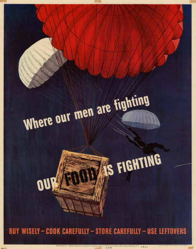
Bold typography cuts across a deep blue sky as parachutes drift downward, their cords converging on a wooden crate stamped “FOOD.” The message is unmistakable: “Where our men are fighting OUR FOOD is FIGHTING,” turning an ordinary supply drop into a vivid symbol of support. With its limited palette and dramatic diagonal text, the poster uses movement and contrast to make wartime logistics feel urgent and heroic.
Rather than focusing on battlefield scenes, the artwork aims at the home front, arguing that meals, shopping habits, and kitchen discipline mattered as much as uniforms and weapons. The parachutes suggest peril and distance, while the descending box frames food as a lifeline—an essential “weapon” delivered under pressure. It’s a striking example of World War II propaganda design, where art, persuasion, and everyday responsibility were woven tightly together.
Along the bottom, practical instructions ground the soaring imagery: “BUY WISELY—COOK CAREFULLY—STORE CAREFULLY—USE LEFTOVERS.” That line captures the era’s wartime rationing mentality and the campaign to prevent waste, reminding viewers that conservation was framed as patriotism. For readers interested in WWII posters, home front history, or vintage graphic design, this piece offers a memorable window into how governments and artists mobilized public behavior through powerful visual storytelling.